"Past Perfect"
The first 12 summers of designer Kate Davis’s life were some of her best. At the start of each season, she and her parents would migrate from Manhattan to the southeastern shore of Mount Desert Island, Maine. Once there, they settled into Passage West, a six-bedroom, shingle-style cottage built in 1922 atop Ox Hill in Seal Harbor. When her parents divorced, Davis and her mom continued summering in Seal Harbor, renting various places until her mother purchased a house on the edge of Acadia National Park. Still, Davis’s fondest memories hail from her early childhood at Passage West.
In 2019 Davis, the founder of Manhattan-based Davis Designs, learned that Passage West was for sale. She and her husband, who own another historic property on Ox Hill, purchased the decaying 3,665 square foot cottage, which Davis restored for their adult children. “I knew I could bring it back to the home I remembered from my childhood,” says the designer, who feels passionately about saving old houses.
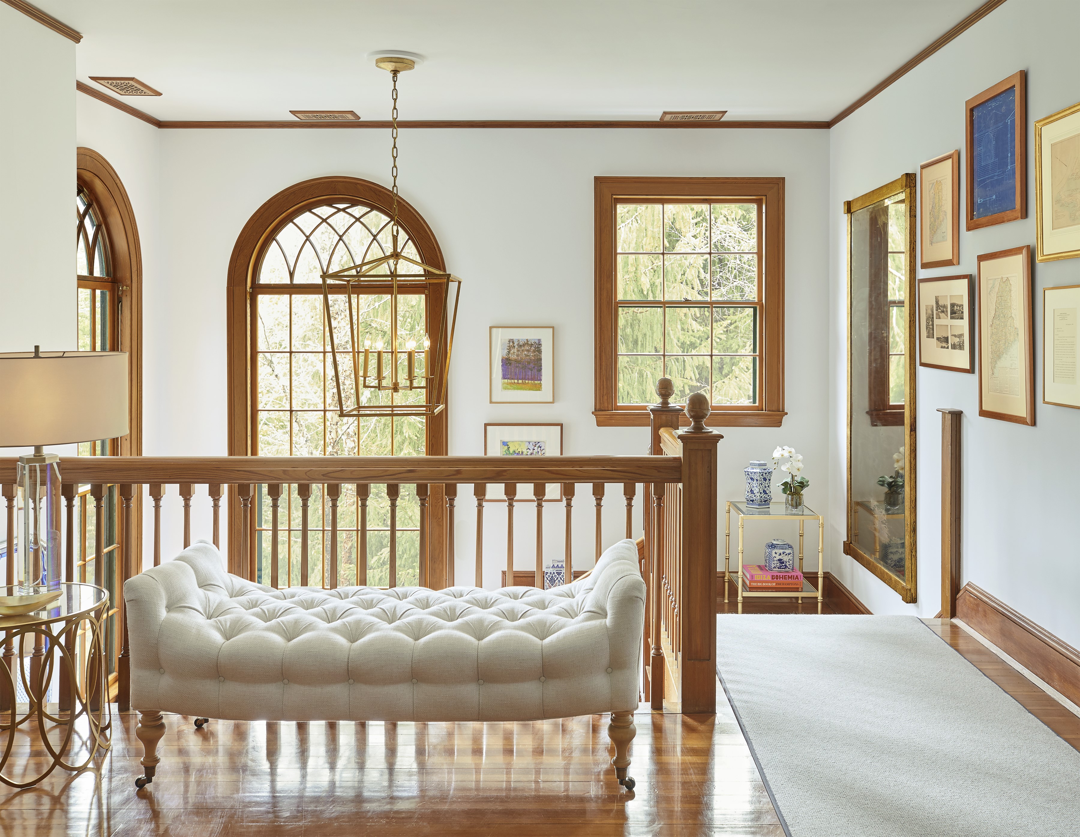
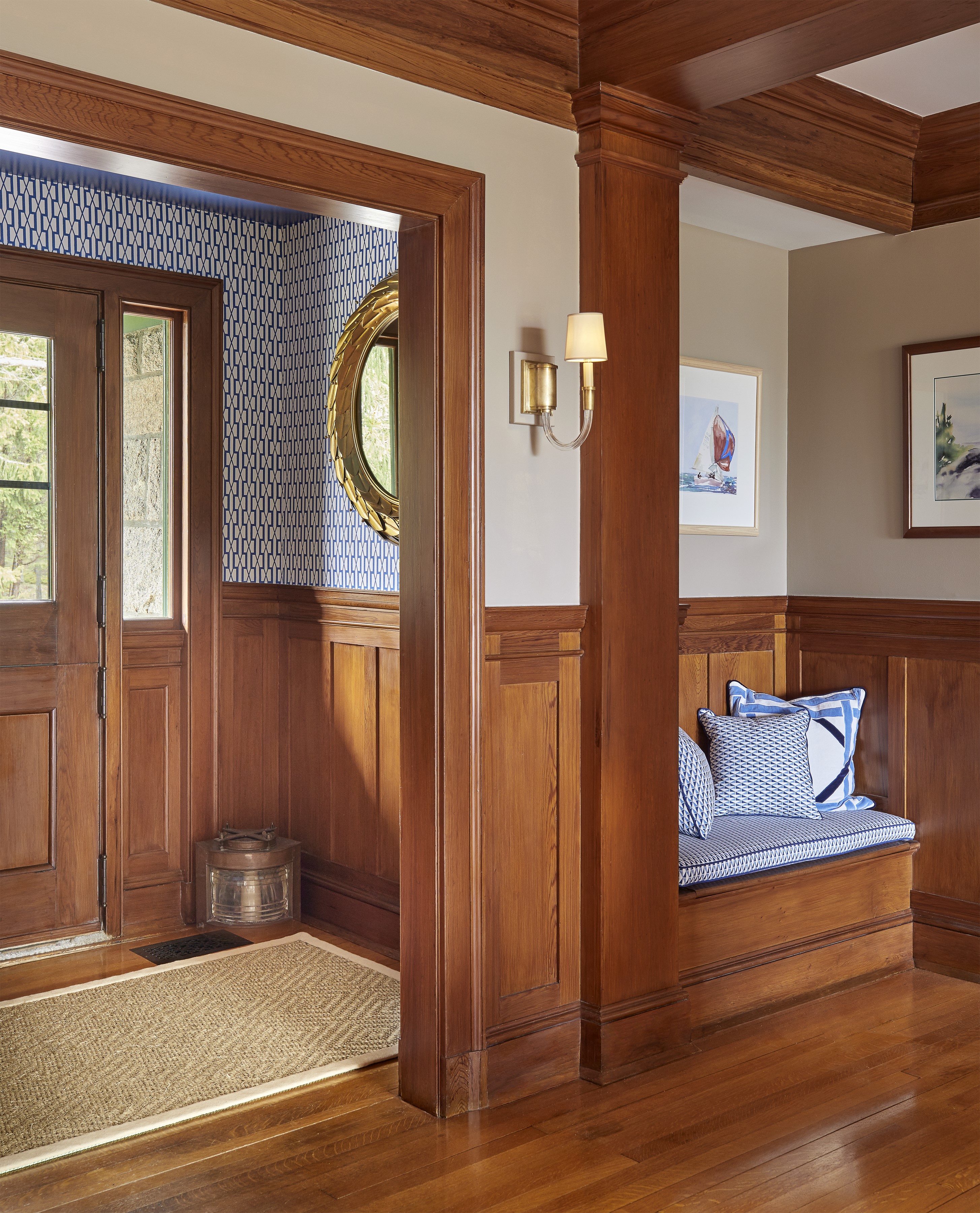
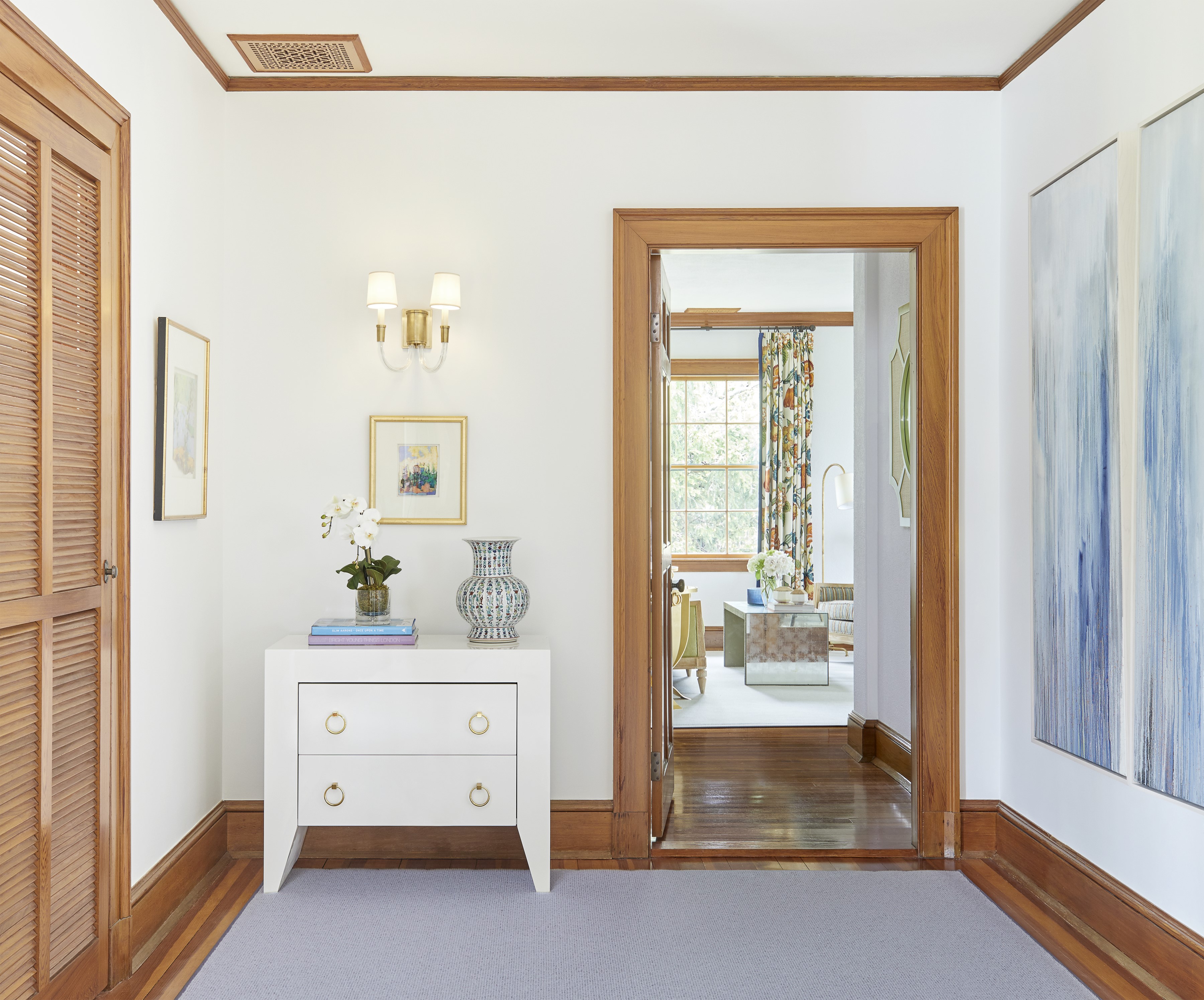
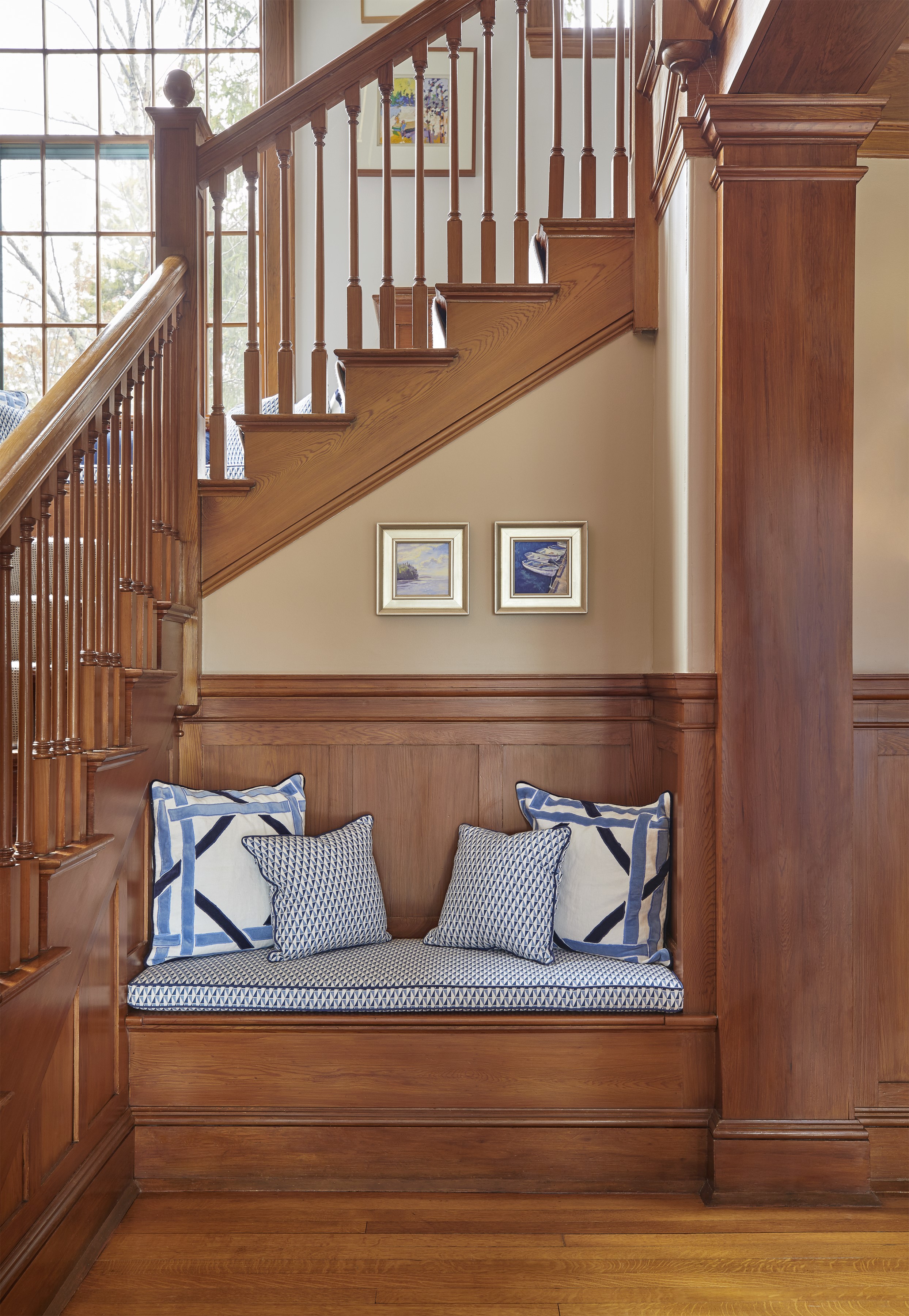
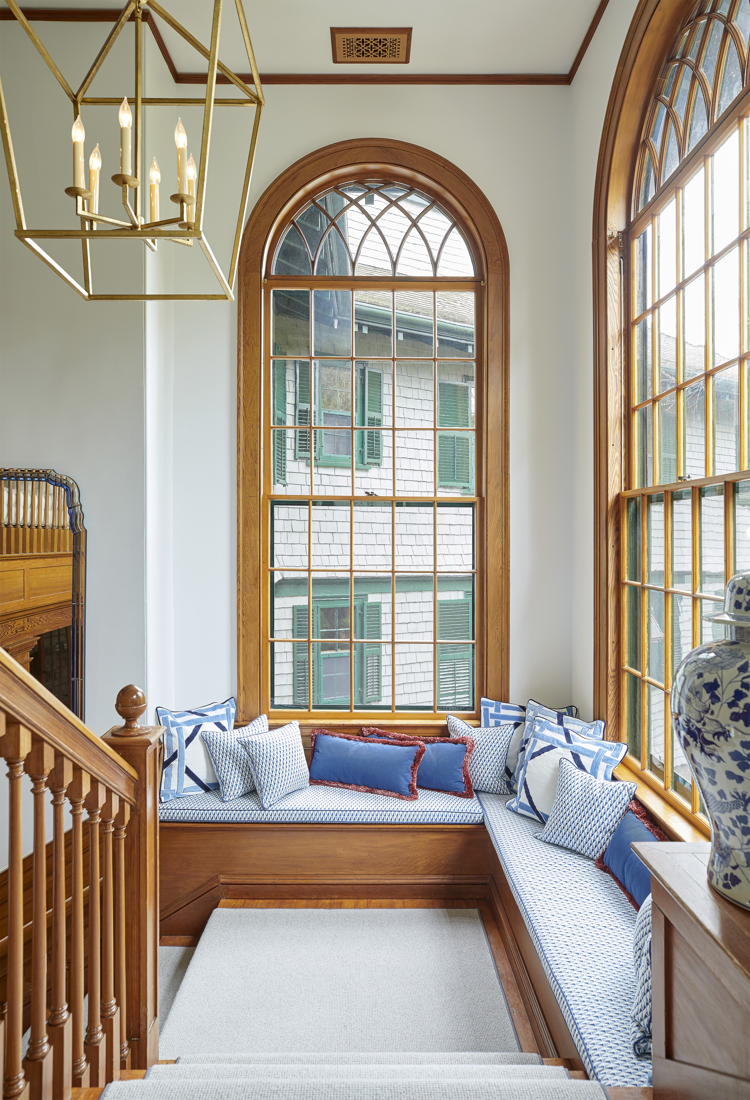
Davis describes the renovation, during which the crew peeled the three-story structure down to the studs, as a two-year labor of love. “Anyone else would have torn it down,” says Keith Higgins of EL Higgins Building and Remodeling. “We spent a lot of time restoring whatever we could—windows with wavy glass, doors that needed to be squared up, reclaimed maple floors—to retain the old character,” he says.
The team also replaced the crumbling stone pillars that hold up the back of the house with steel beams. “The house was literally sinking,” Davis says. “The floor on one side of the [southernmost] bedroom was almost seven inches higher than on the other. The prior owners had taken to propping furniture up on blocks to make it look even!”
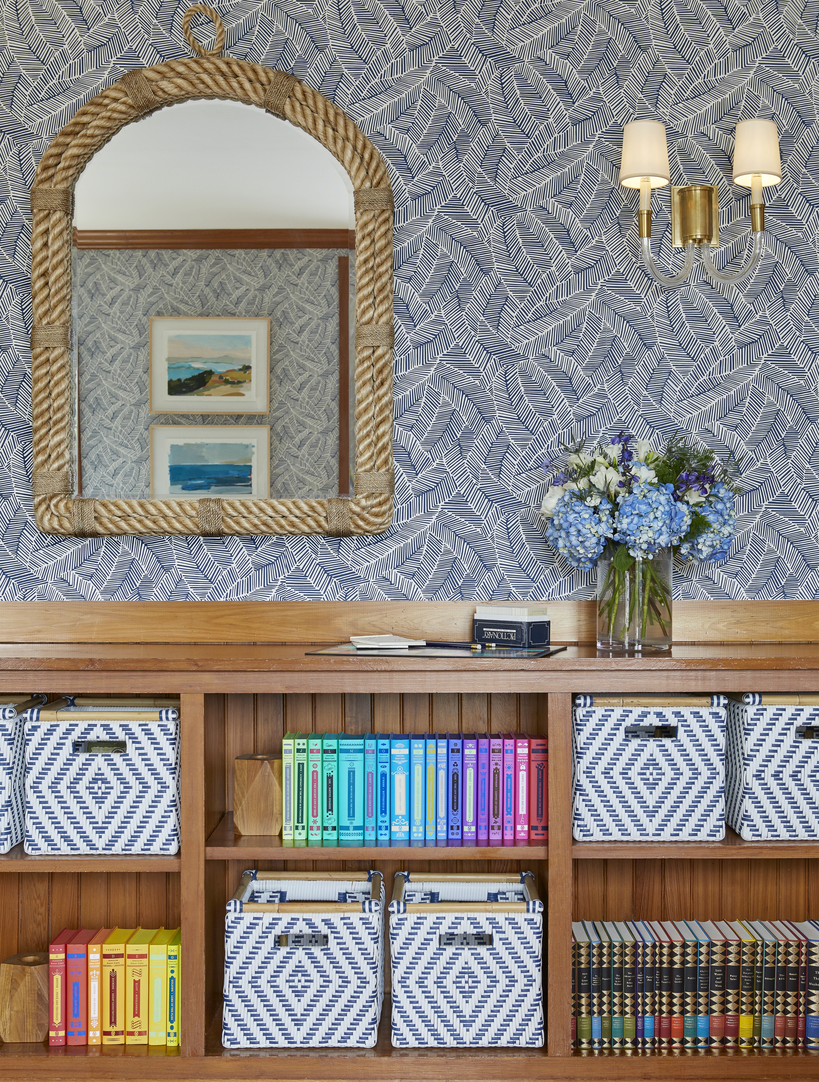
The cottage came full of furnishings, including many that Davis remembers from her childhood. As a designer who favors reusing pieces over getting rid of them—she often stores items unwanted by one client to reappropriate for another—Davis challenged herself to use as many of Passage West’s contents as possible. According to her mother, she even put the same faded books back on the sunroom shelves.
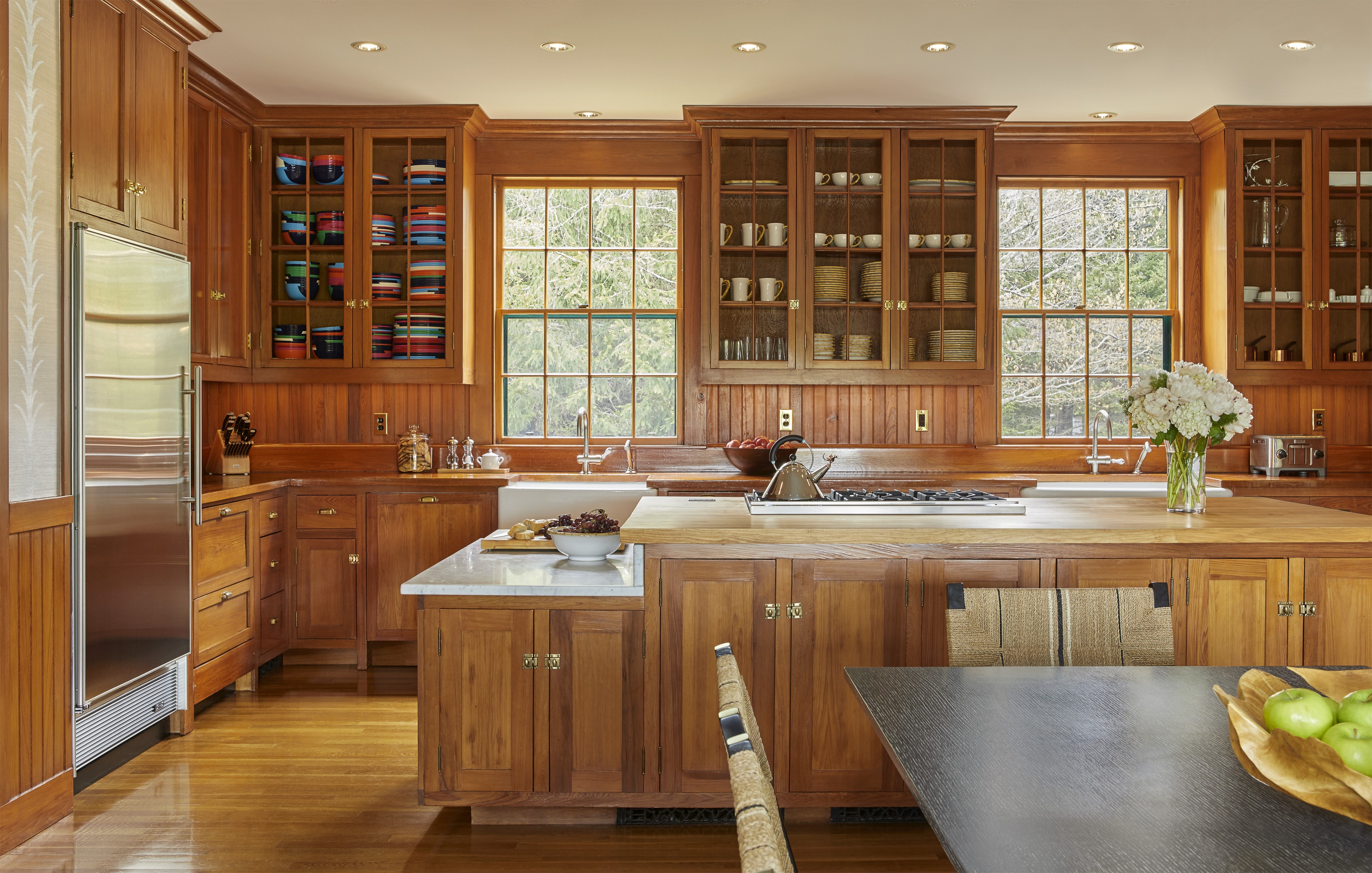
Architectural designer Todd Stanley, founder of Downeast Home Design, collaborated with Davis to increase functionality and improve flow throughout the home. The most significant changes on the first floor were to the kitchen, where an ancient stove jutted into the space and oddly angled countertops did little to ease circulation. Finding enough square footage to add the center island was a priority. “We bumped back a wall to steal about a foot of space from the dining room,” Stanley says. The new island provides an expansive work surface, additional storage, and a spot for a single stool at one end.
High-end appliances (“Everything works now!” her mom exclaimed.) and simple white cabinetry with sturdy pulls are obviously updated but not slick or suburban. Granite countertops sourced at a quarry on nearby Swans Island lend a rustic feel and tie to the landscape. “When you look out the kitchen window, you see a big granite mountainside,” Davis says.
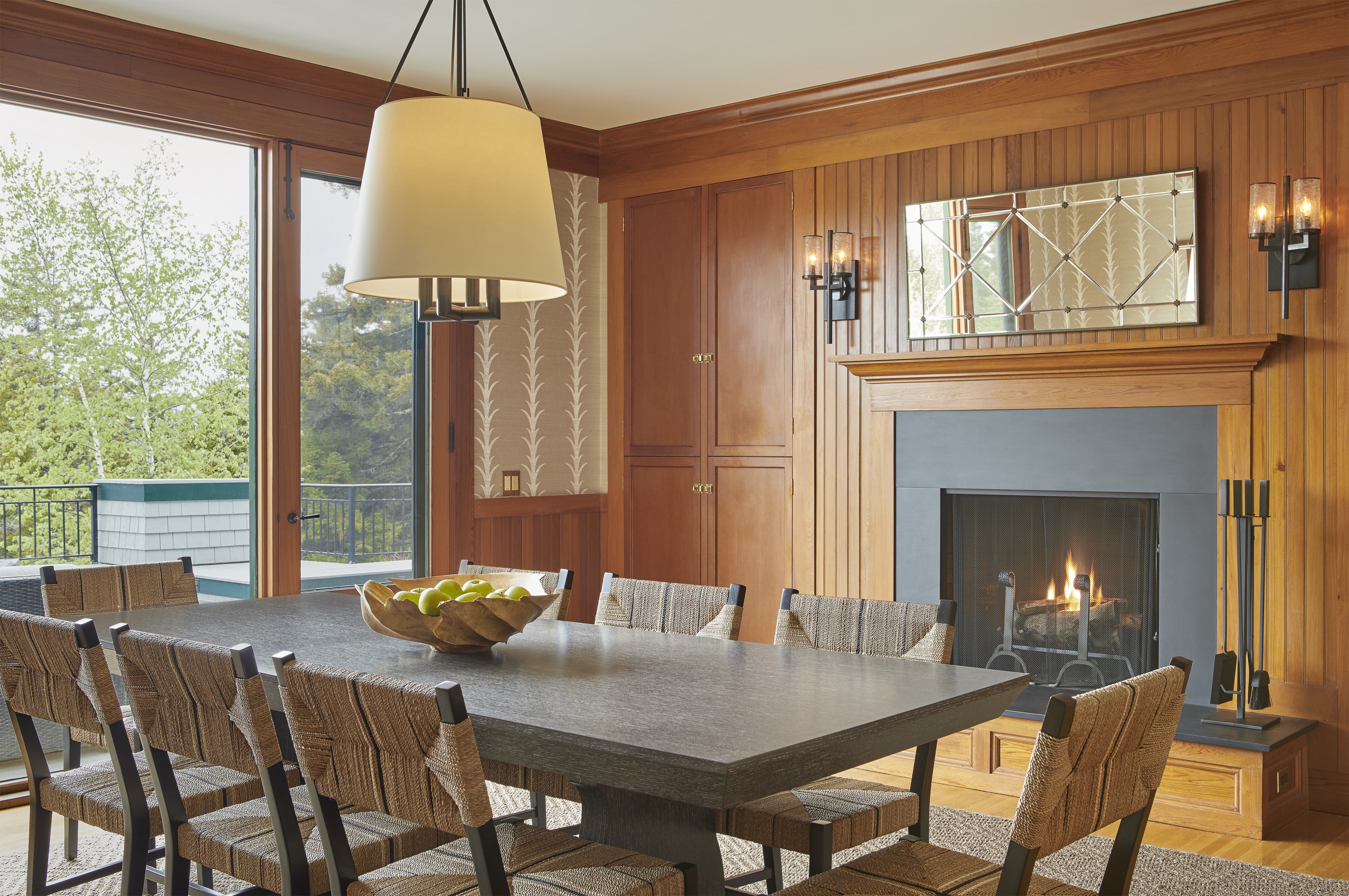
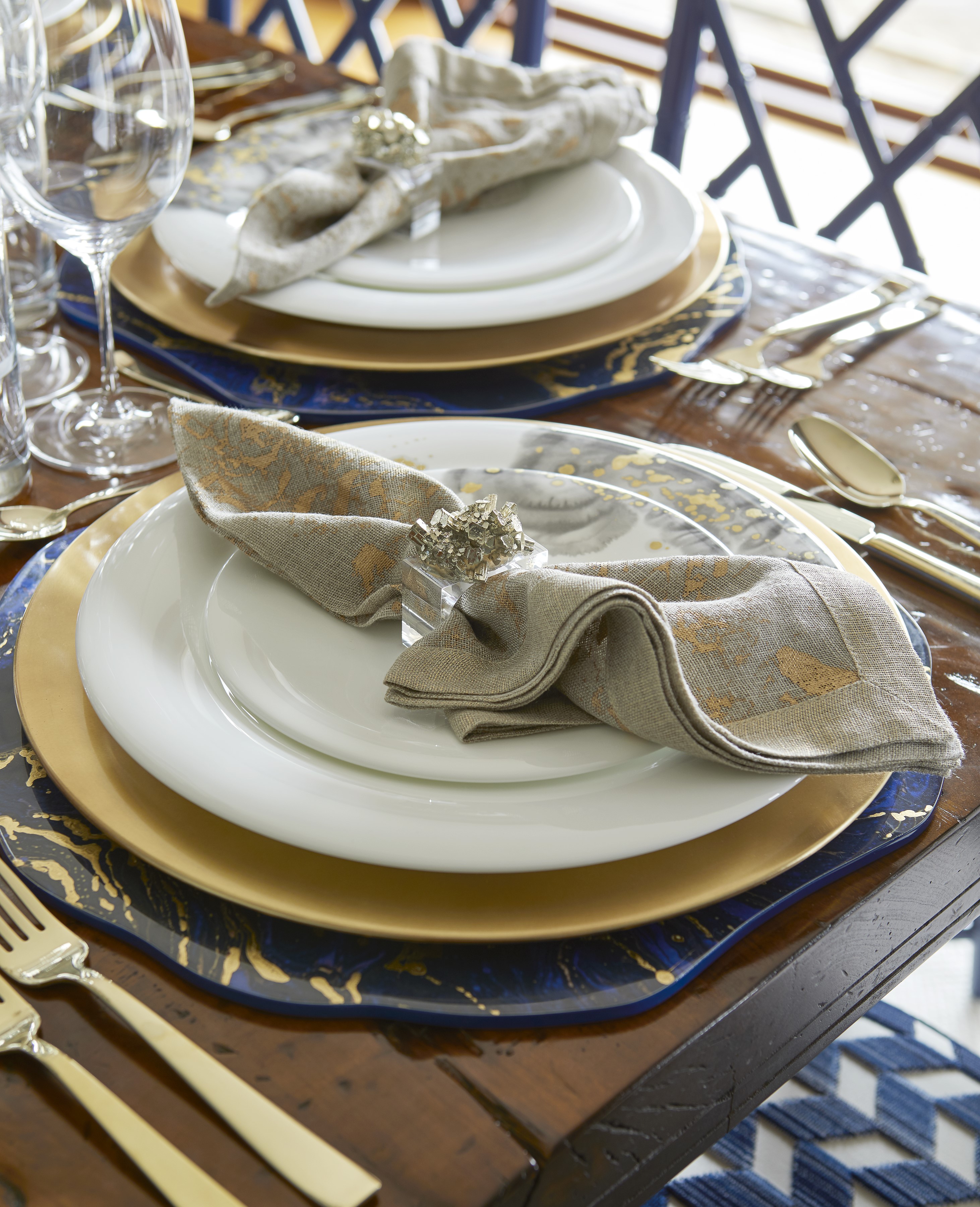
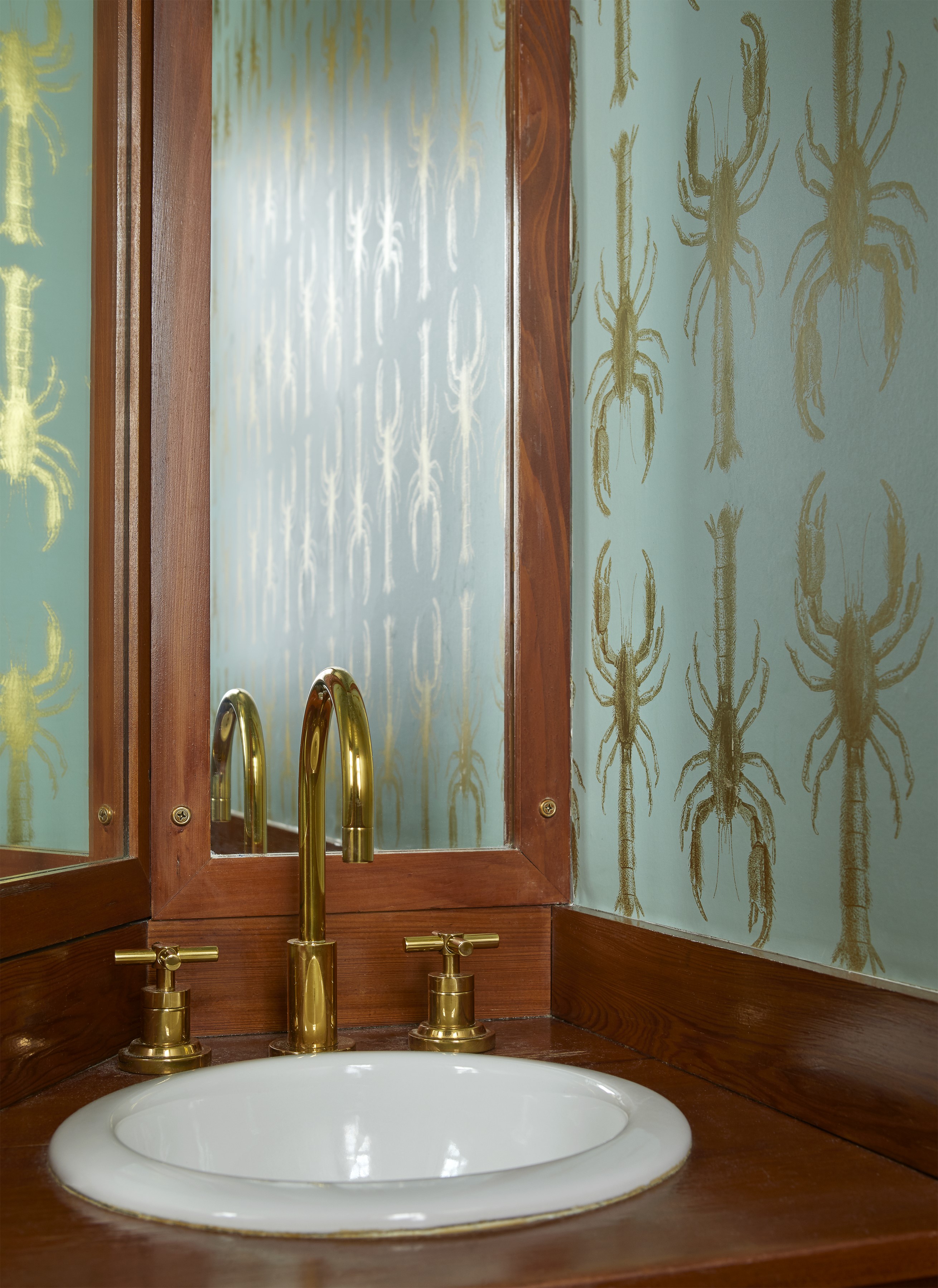
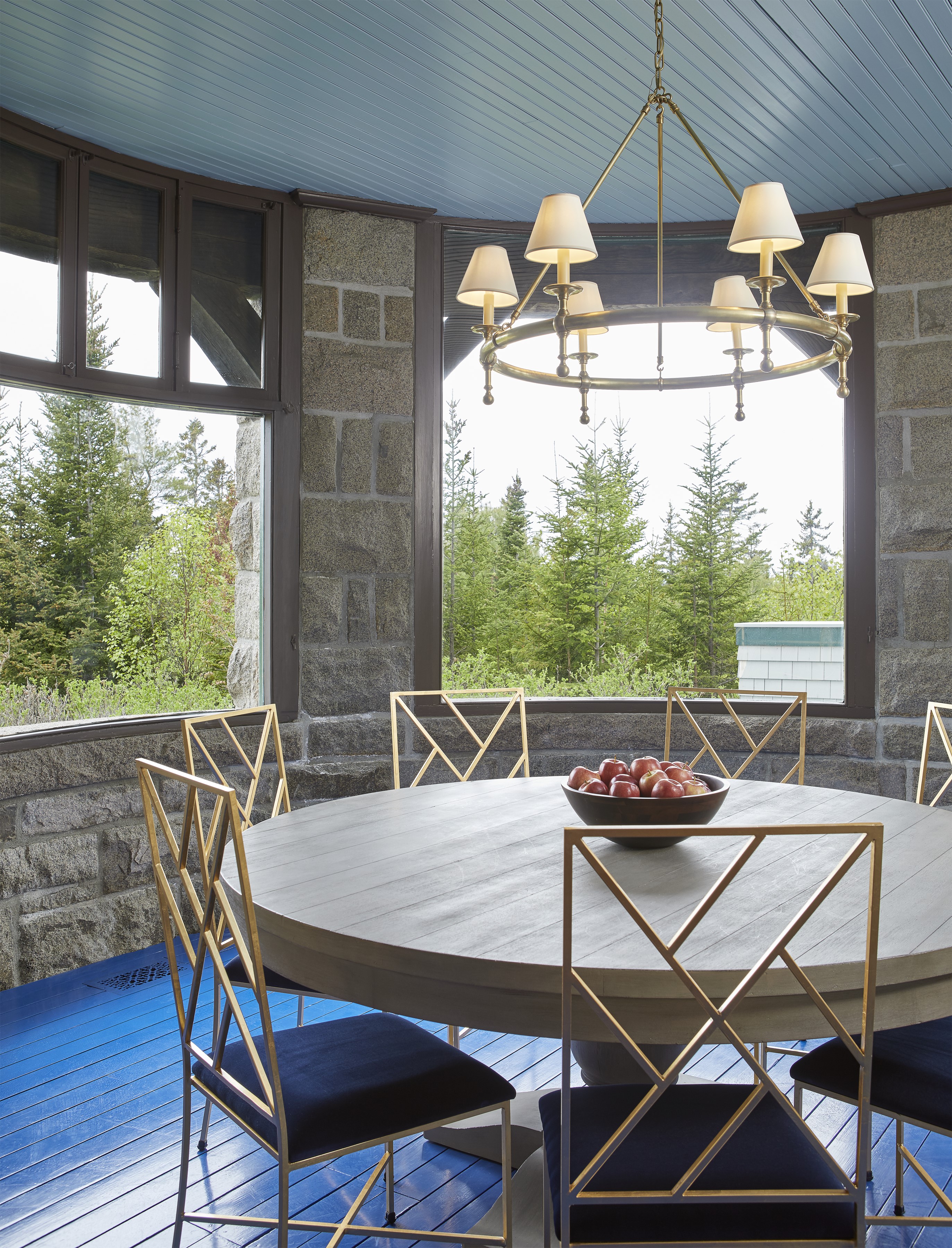
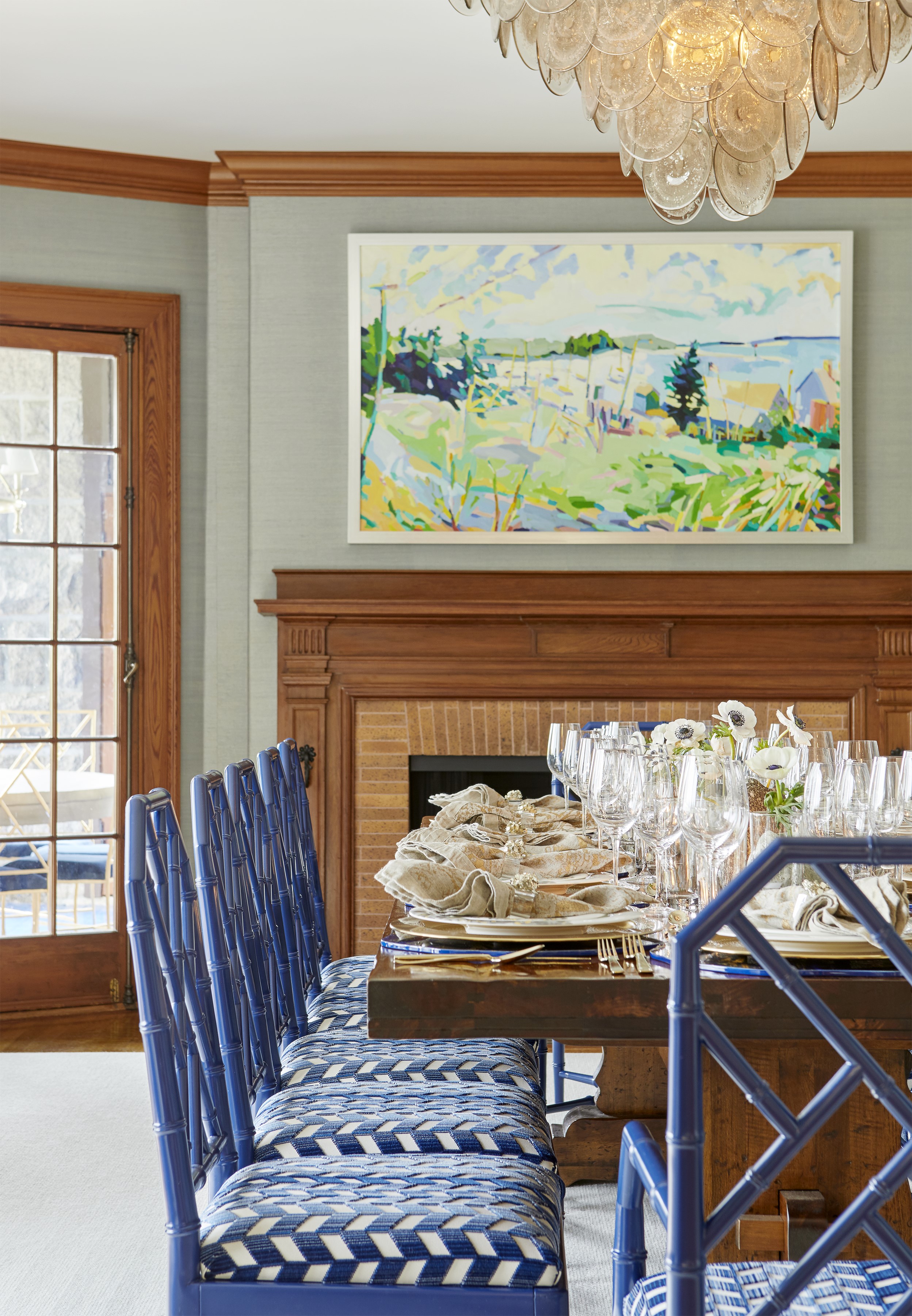
In the formal dining room, lobster wallpaper by Abnormals Anonymous references Maine summer-time fare. “We sat down to dinner together every night as a family, either here or on the back porch,” Davis says. “We boiled lobsters, shucked corn, and shelled fresh peas.” Gold fretwork chairs harken back to New Englanders’ taste for Chinese Chippendale style, though these have durable, faux leather seats. The lacquered table on bamboo legs by designer Miles Redd for Ballard Designs is a similar nod, and budget-friendly to boot. “I like to mix in fun catalog pieces,” Davis says.
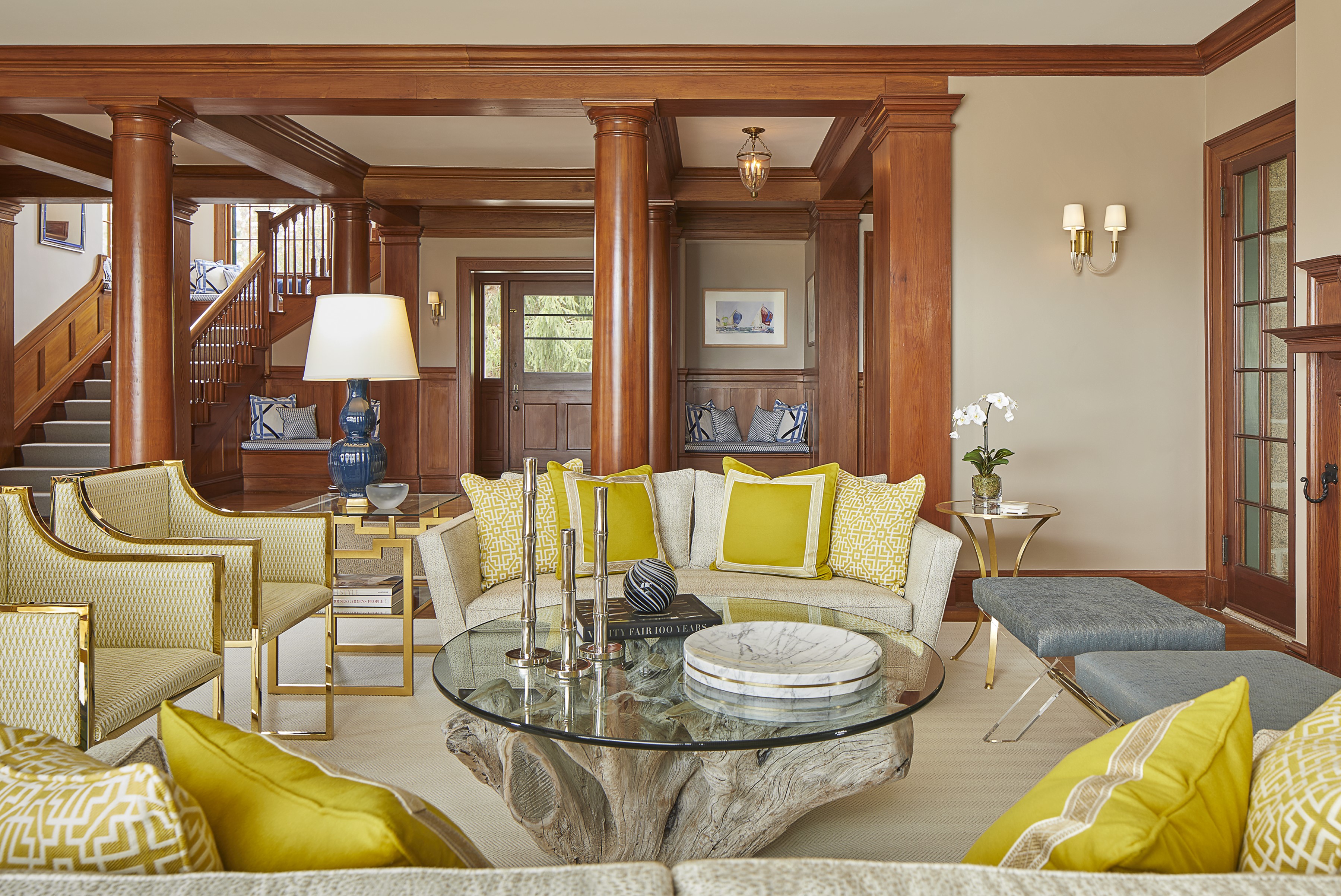
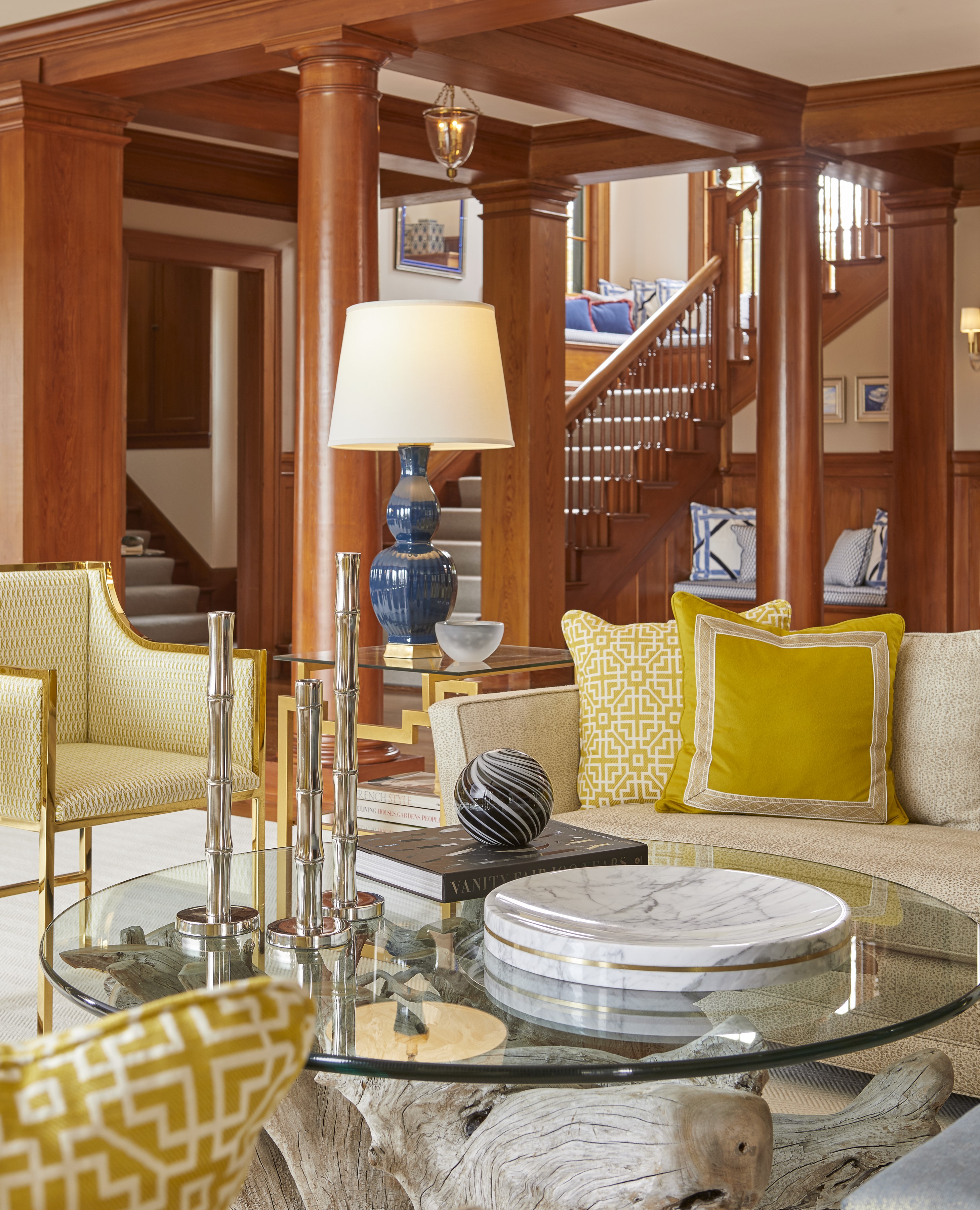
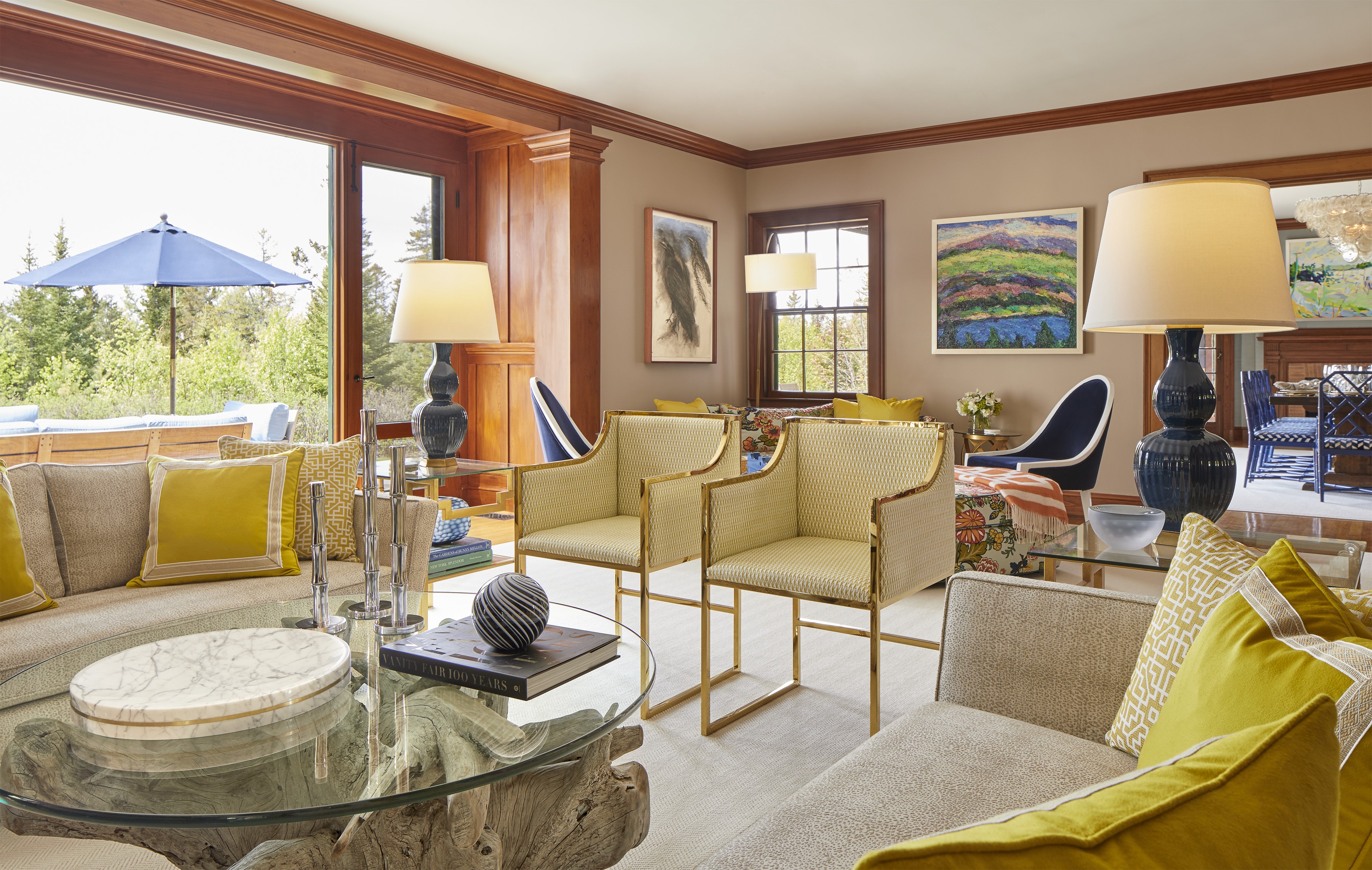
Original antique side tables and chairs, plus a pair of Asian imported lamps, connect the living room to its roots, while the saturated teal trim infuses a summer-house sensibility and enlivens the mantel. “I have vivid memories of roasting marshmallows in this fireplace,” Davis says. Another mainstay was the old foghorn Davis and her friends used to blow (and drive her parents crazy). Unfortunately, it was nowhere to be found. “I am desperate to reclaim it,” she says.
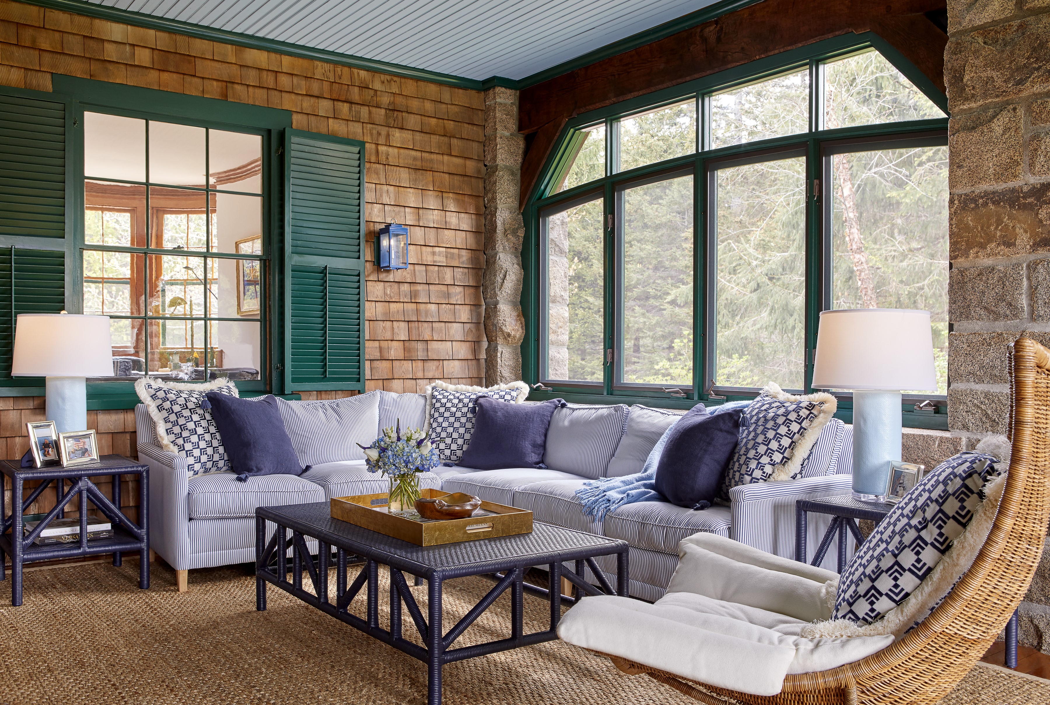
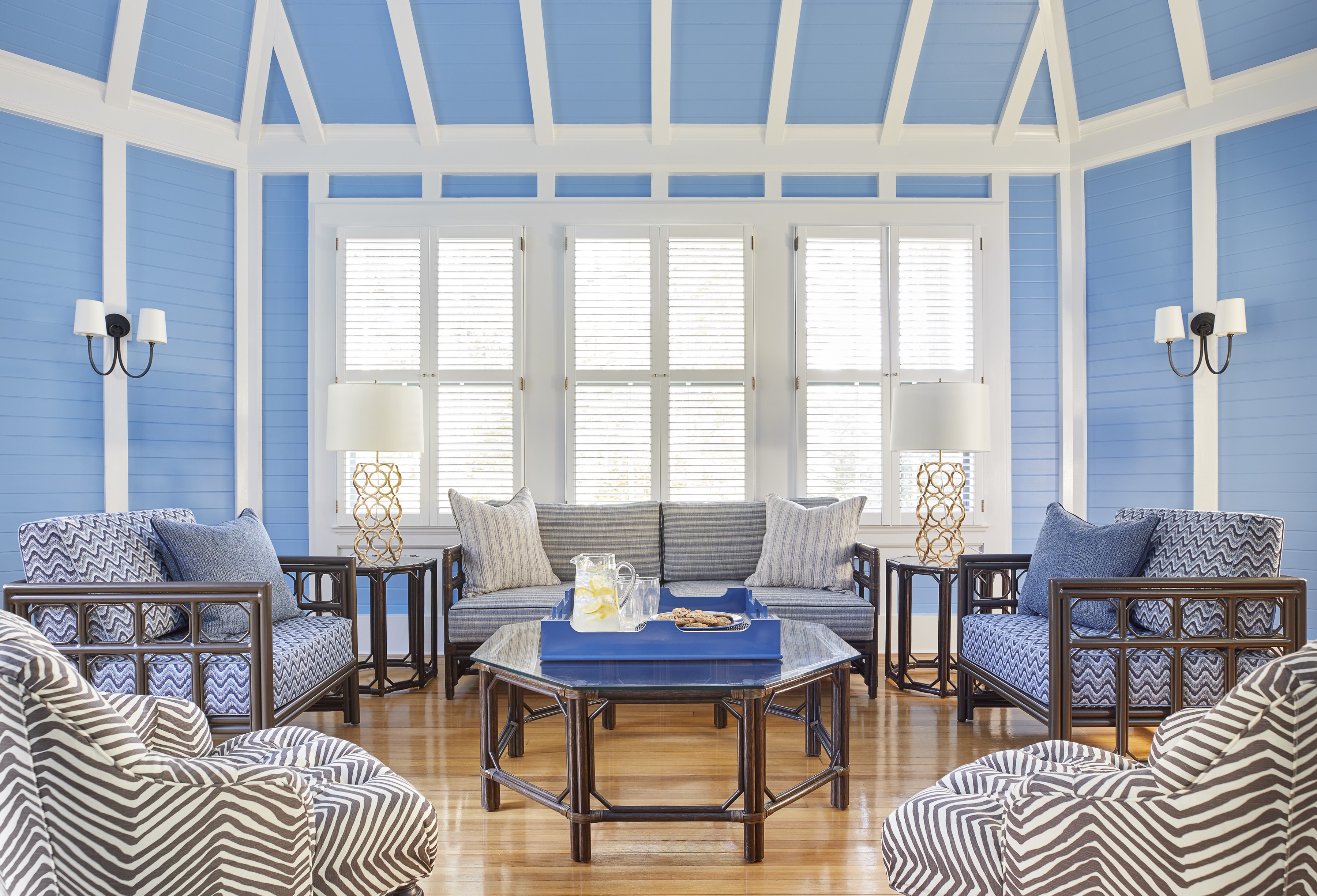
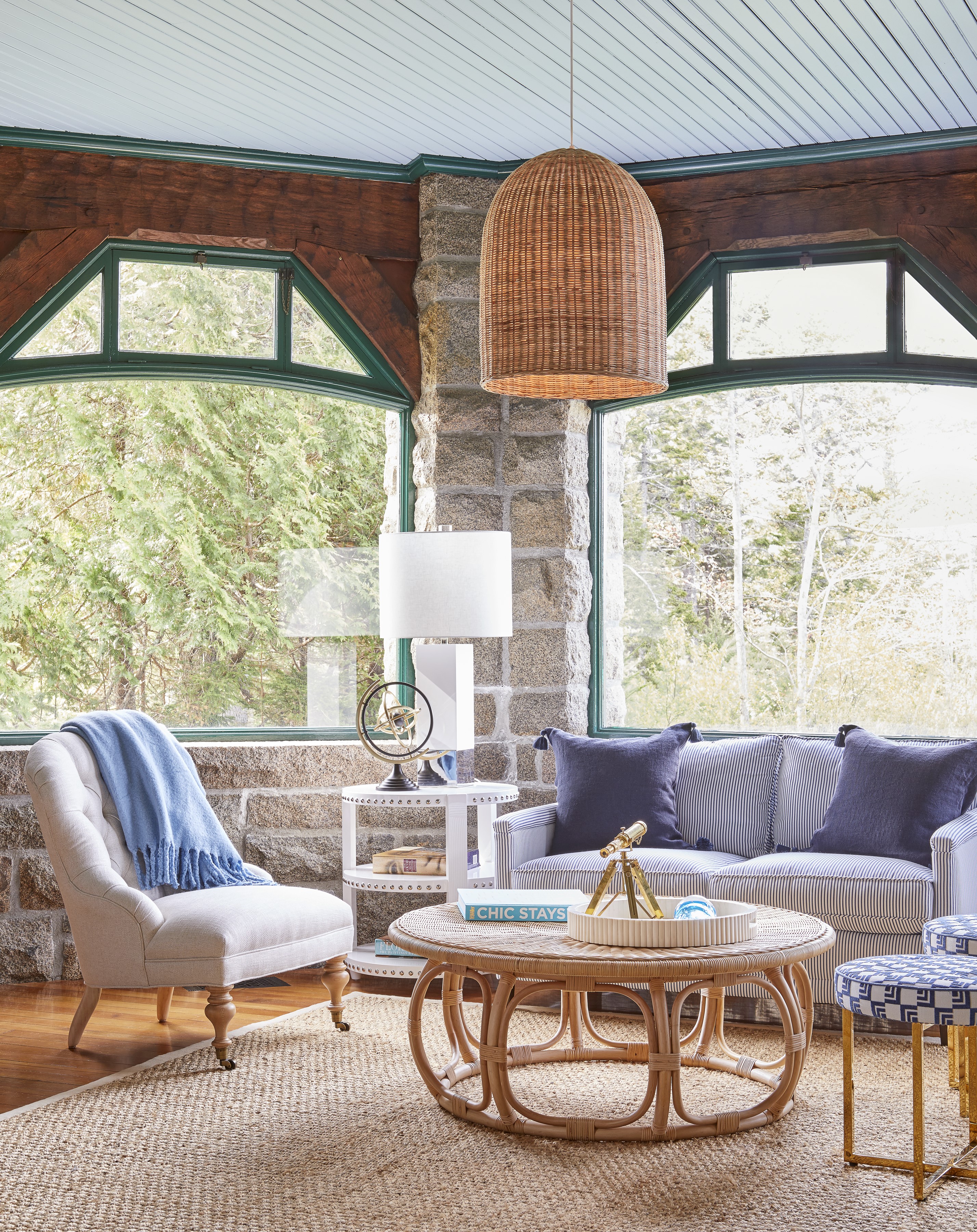
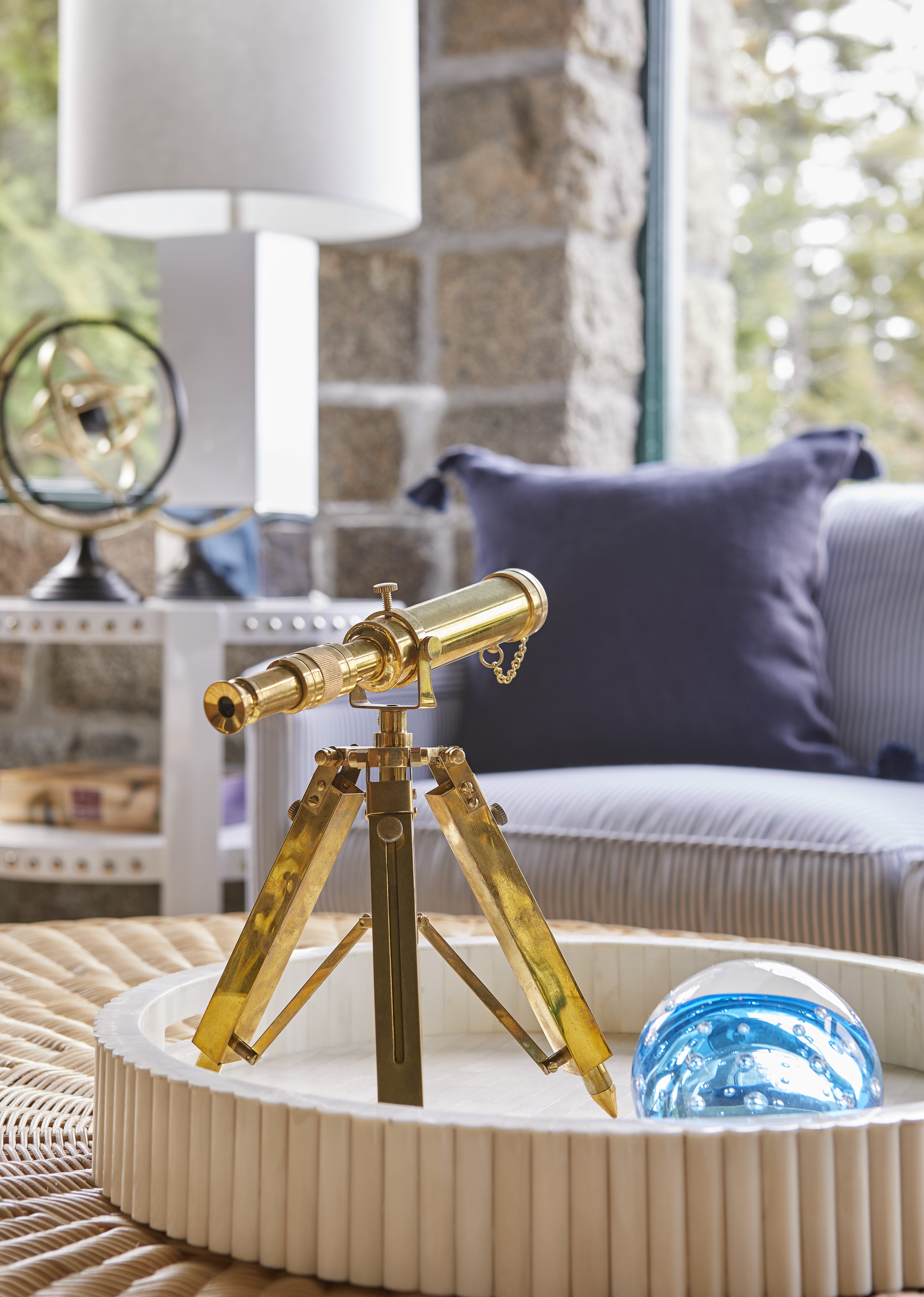
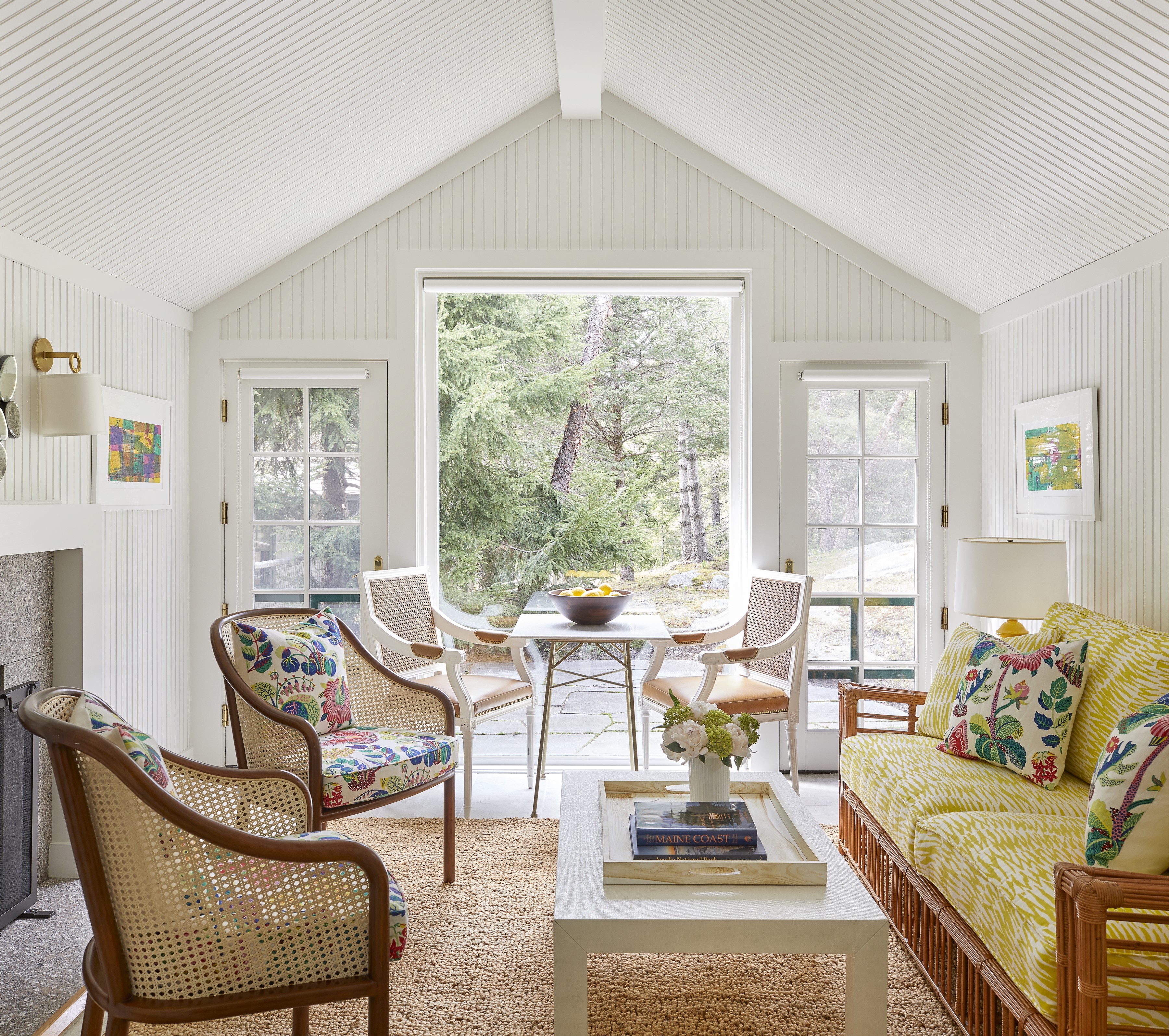
The sunroom, with its Serena and Lily sectional upholstered in awning stripe performance fabric and its flat-screen television, is outfitted for twenty-first- century families. “There were no TVs in Seal Harbor when I was growing up; they were practically illegal,” Davis laughs. The model ships that the designer returned to the windowsill inspired her choice of wallpaper: St. Tropez by Lee Jofa, featuring oversized sails. “I raced 420 [sailboats] in college and have been waiting forever to use it,” she says.
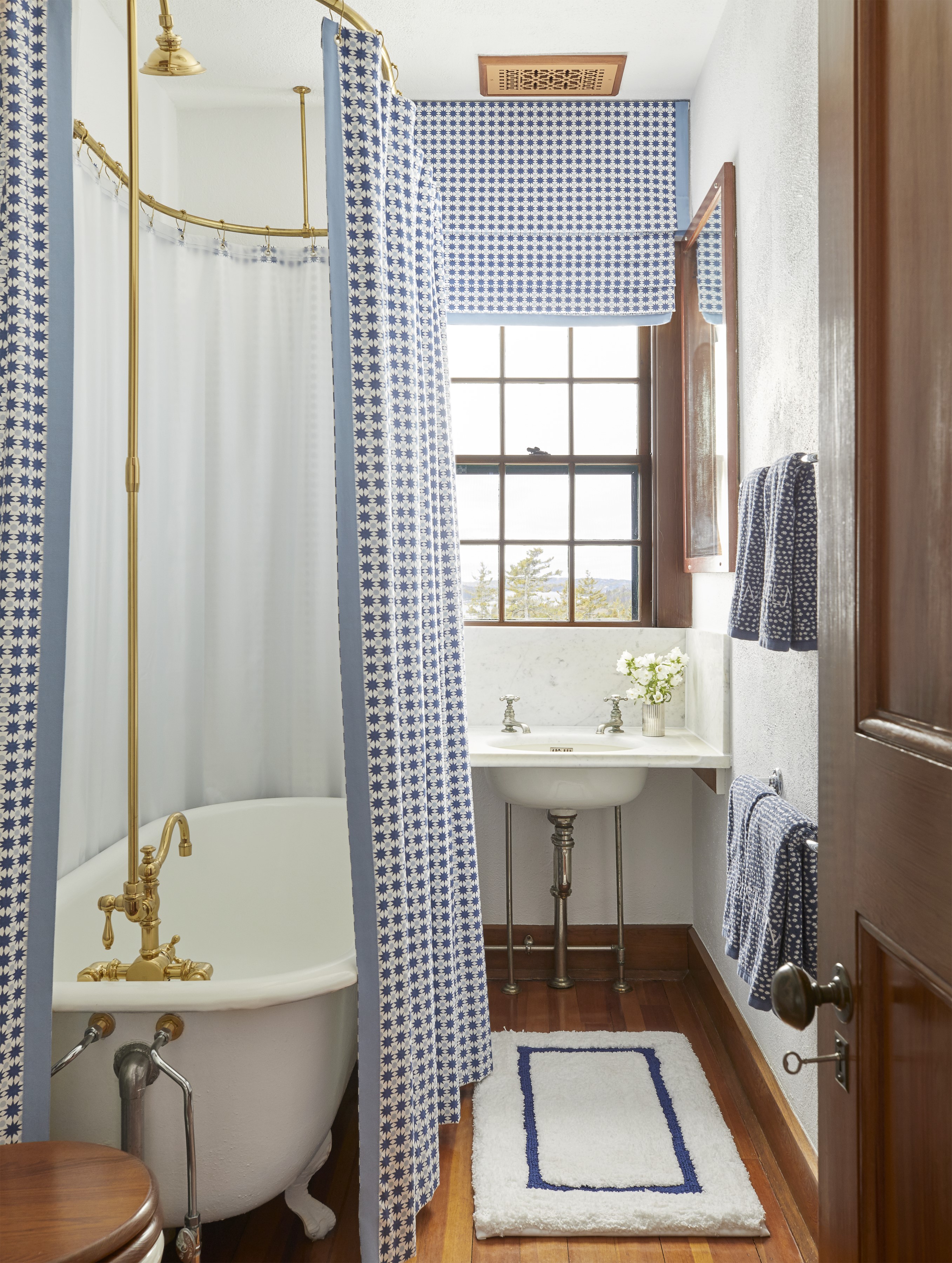
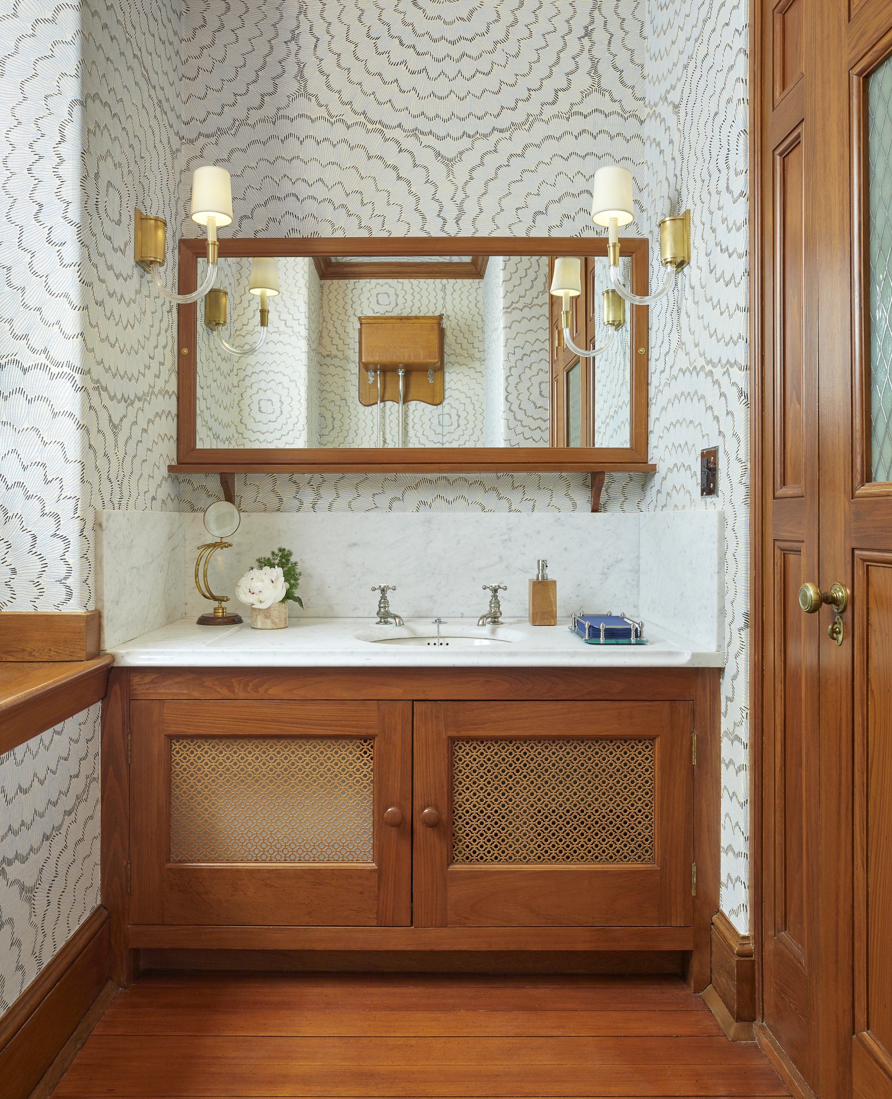
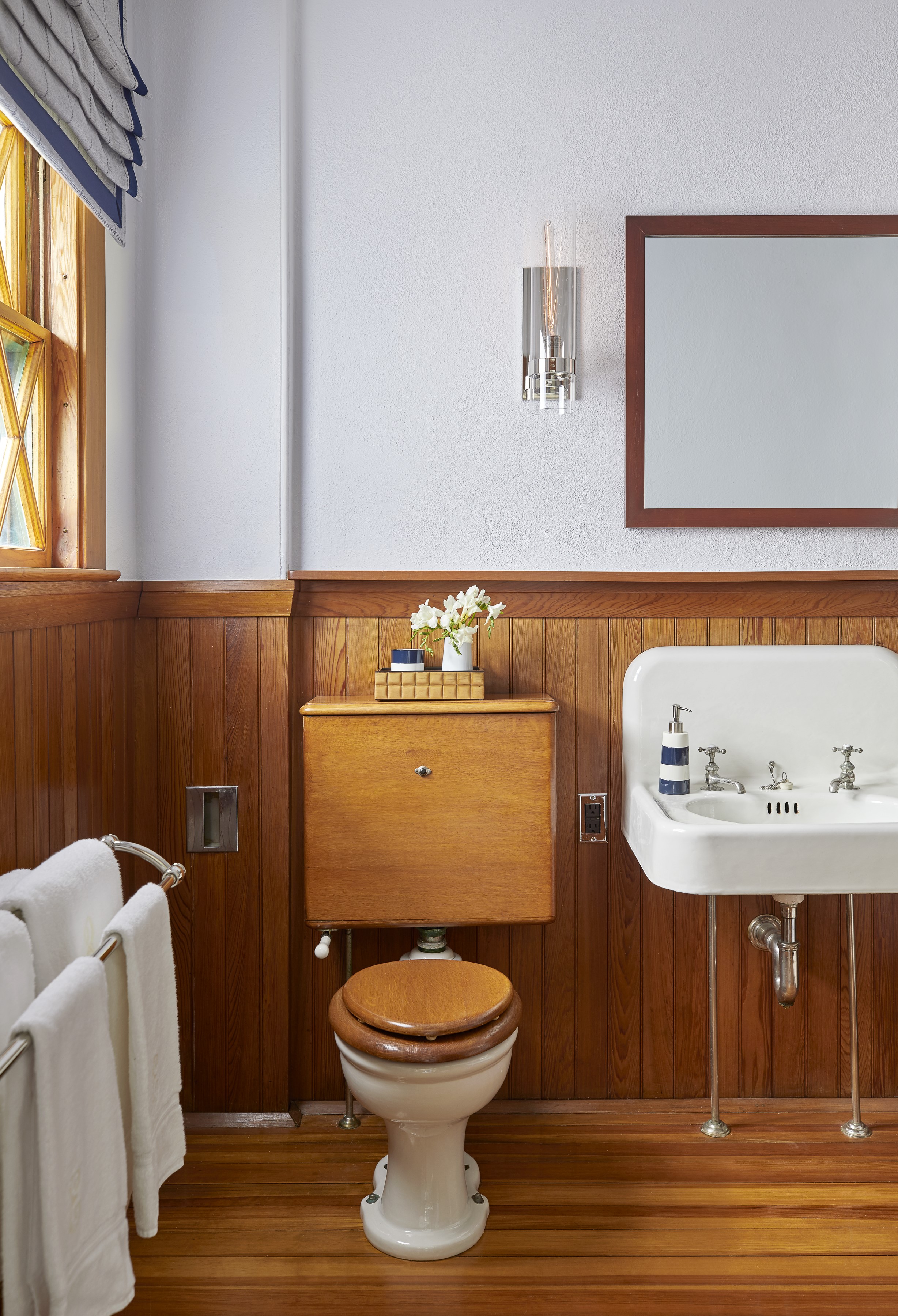
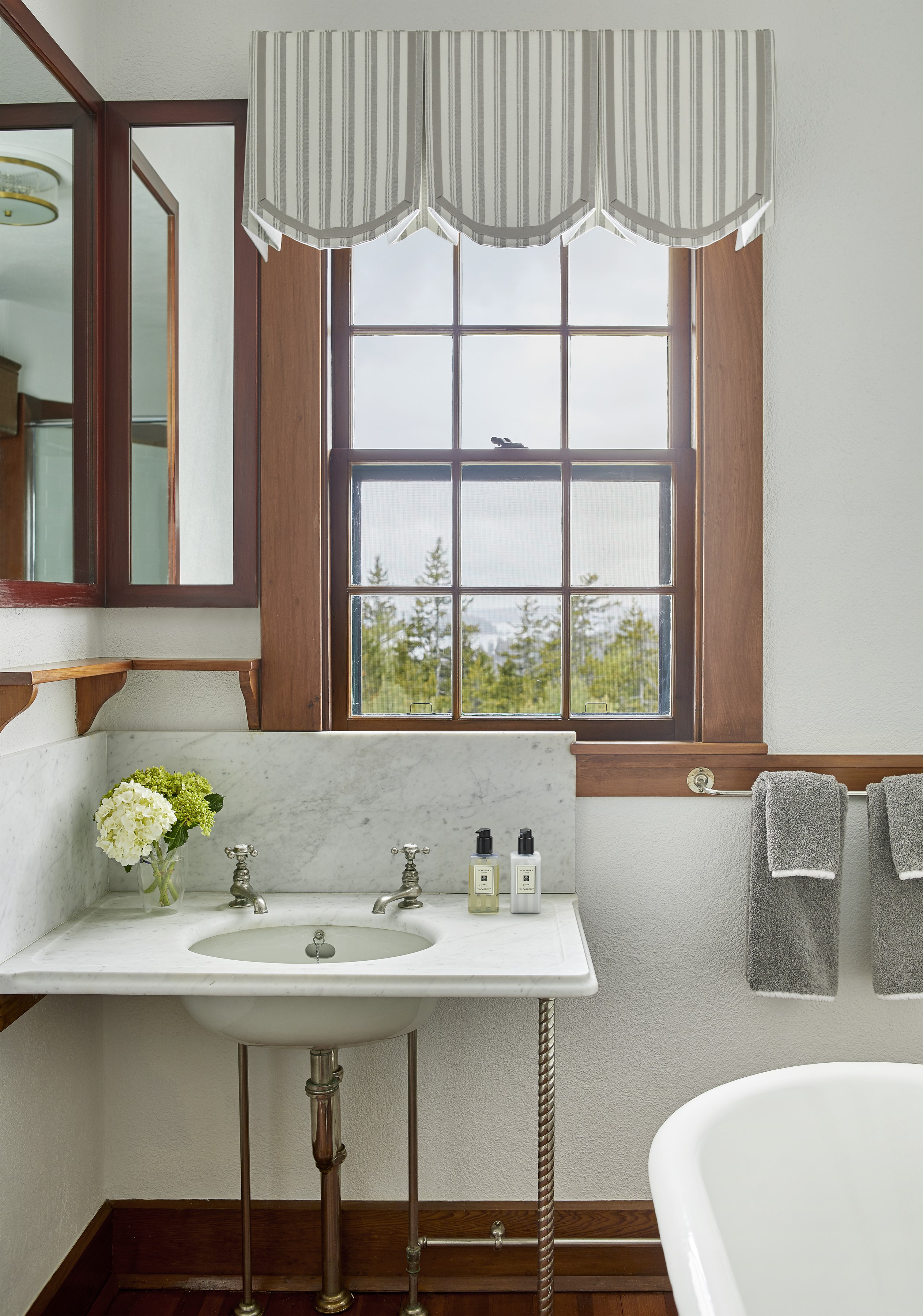
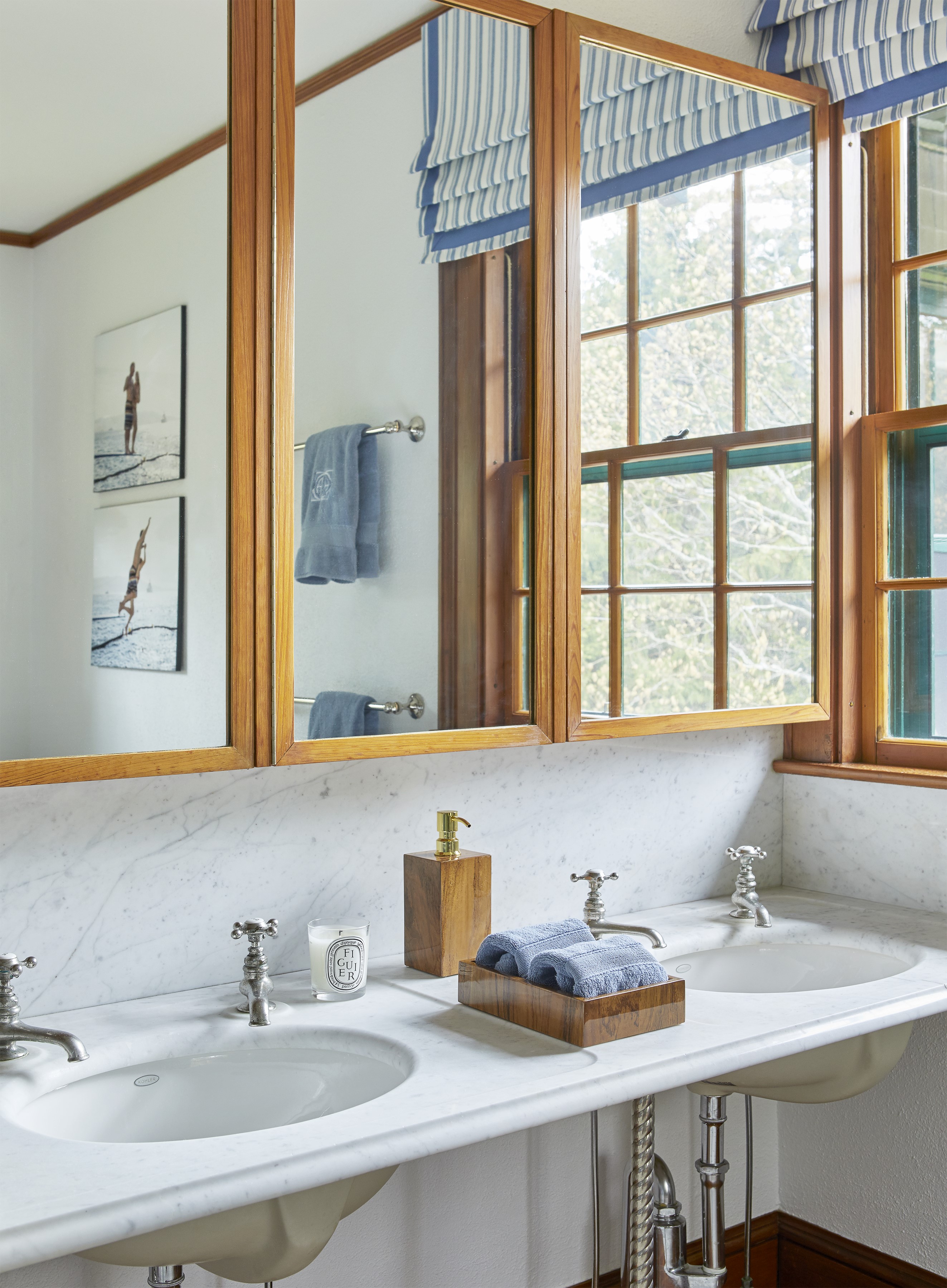
On the second and third floors, Davis and Stanley rejiggered the layouts in order to create five well-appointed bathrooms. Each have a distinct personality; some retain the original cast-iron tubs. When she was a kid, old-fashioned baths were a point of pride in Seal Harbor. “Houses only had clawfoot tubs; putting in a shower was frowned upon,” Davis explains. That said, at 5:30 p.m., “I’ll be back in 20 minutes,” was a common refrain. “Everyone from the Hill would descend upon the tennis club to shower in the locker room,” she recalls.
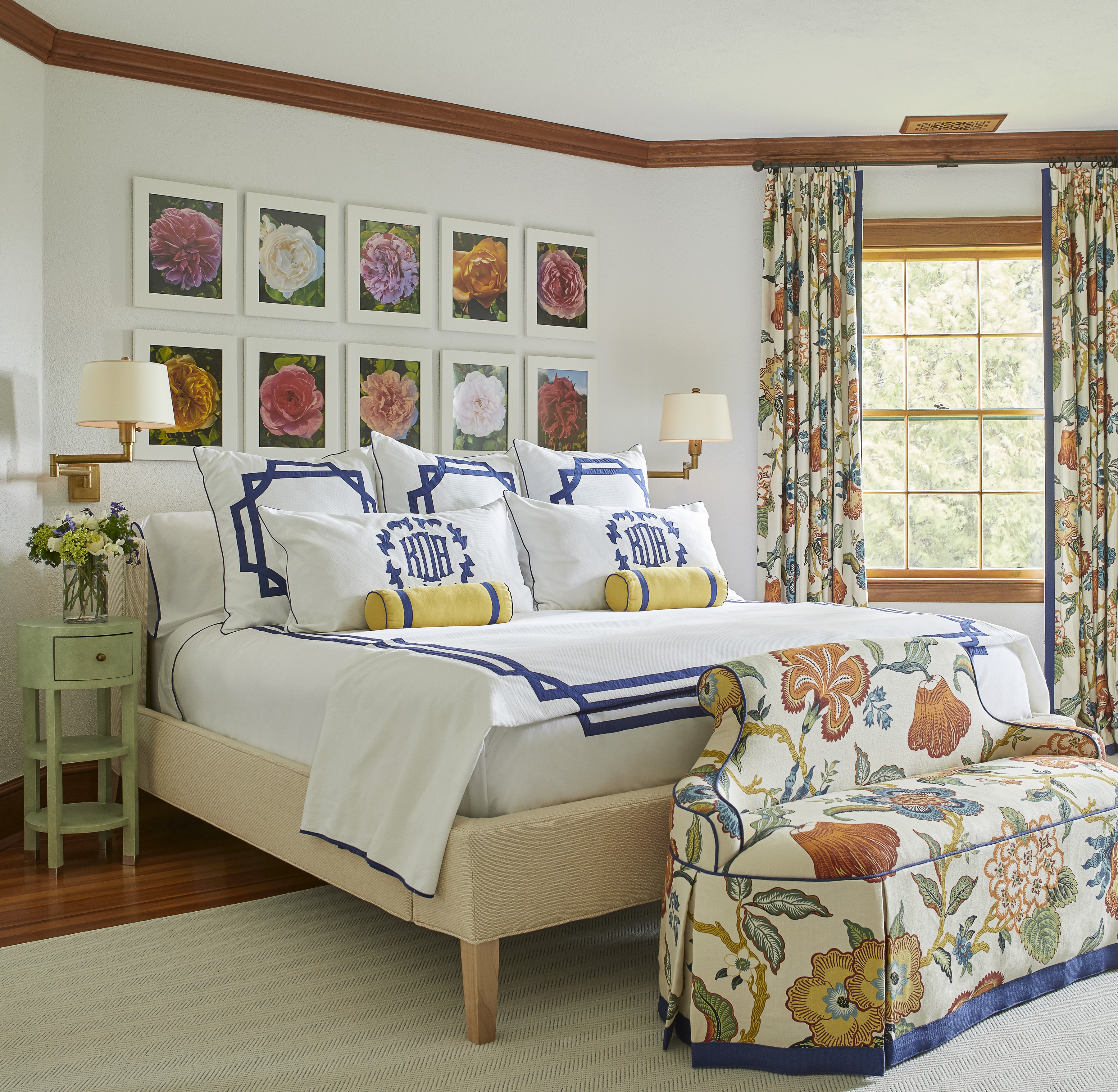
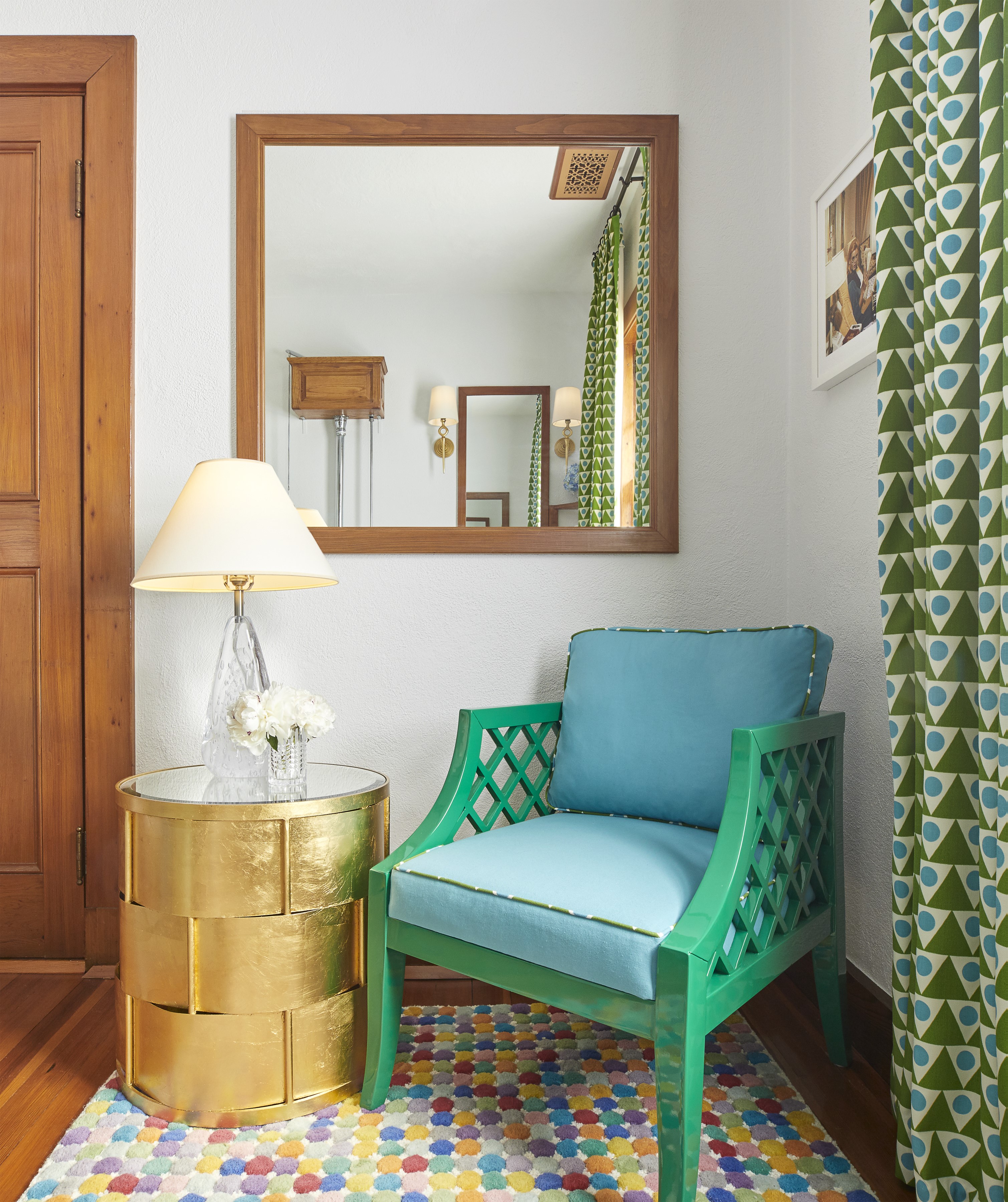
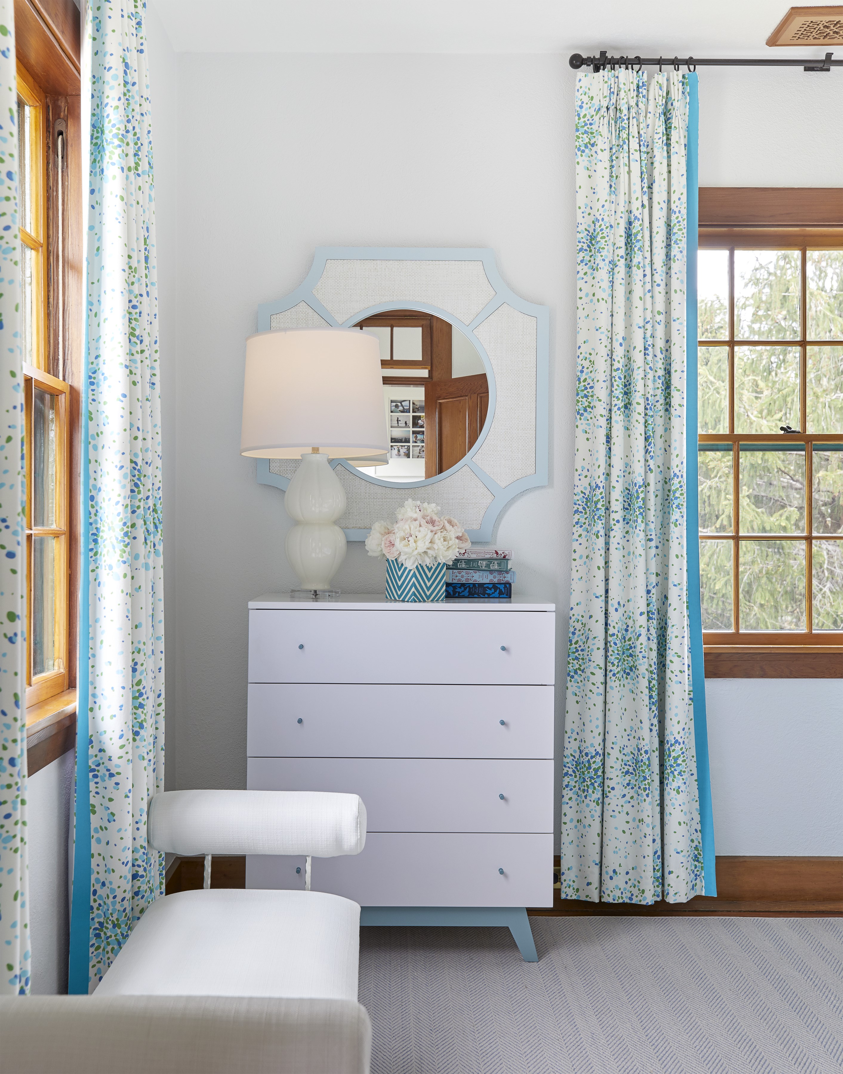
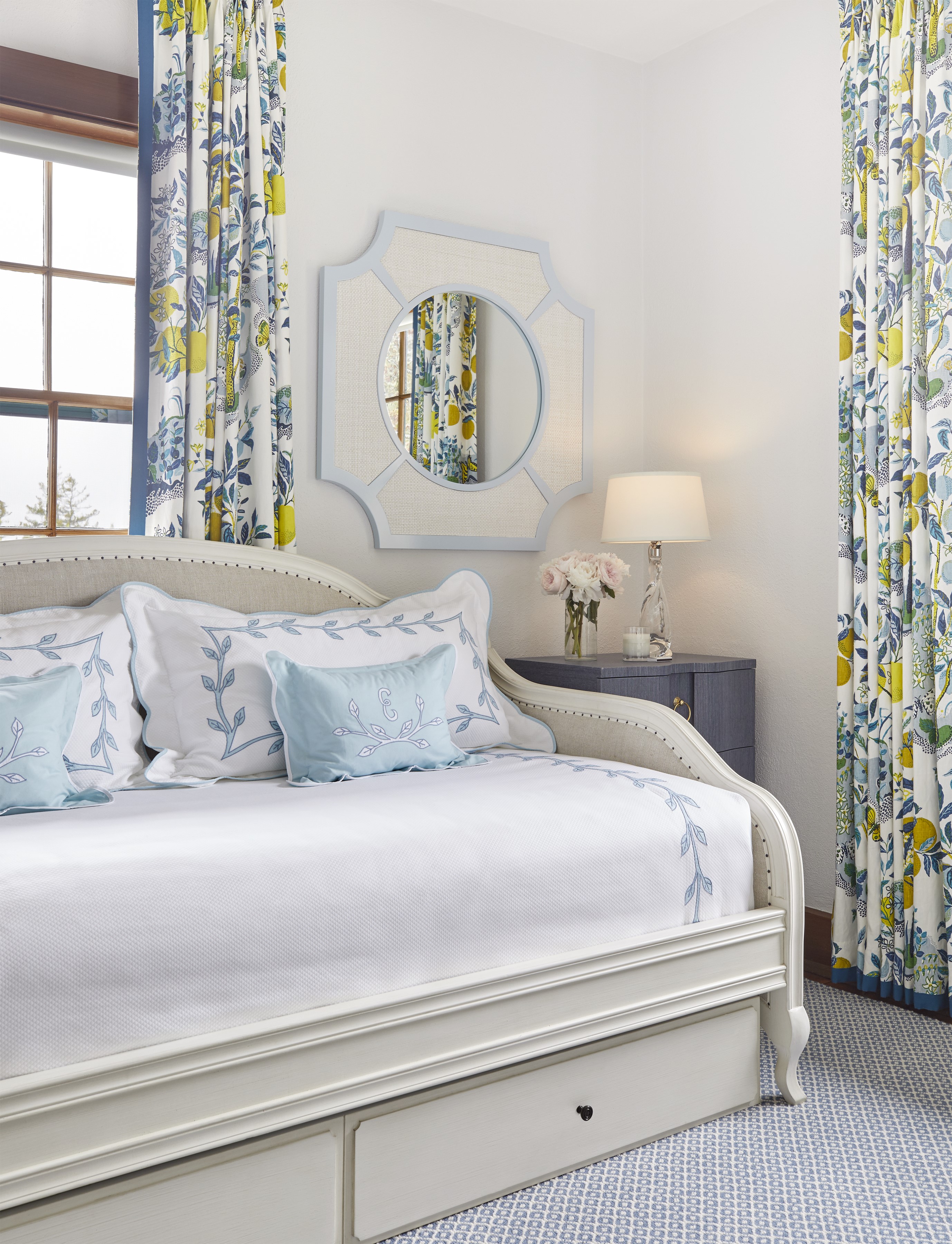
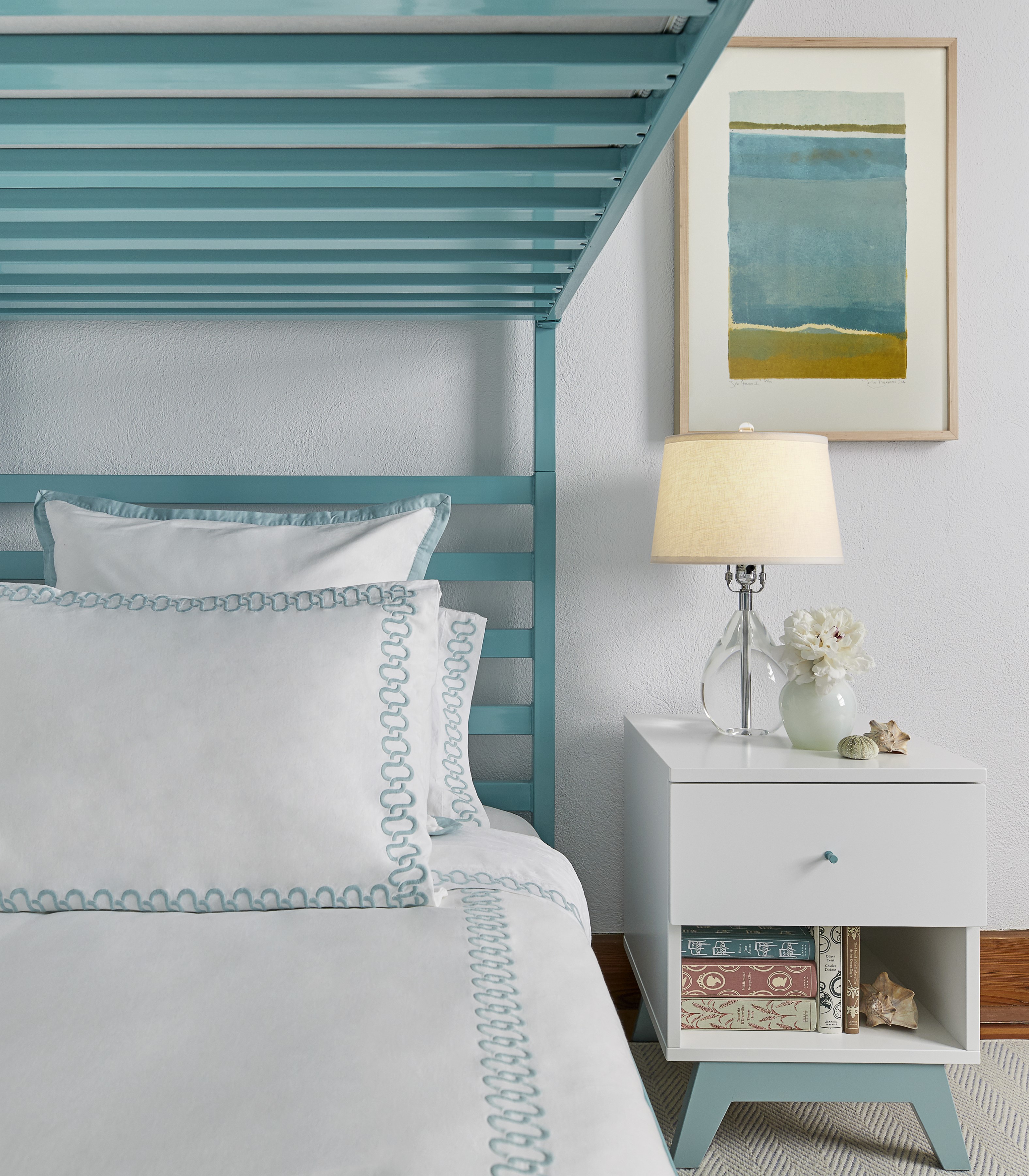
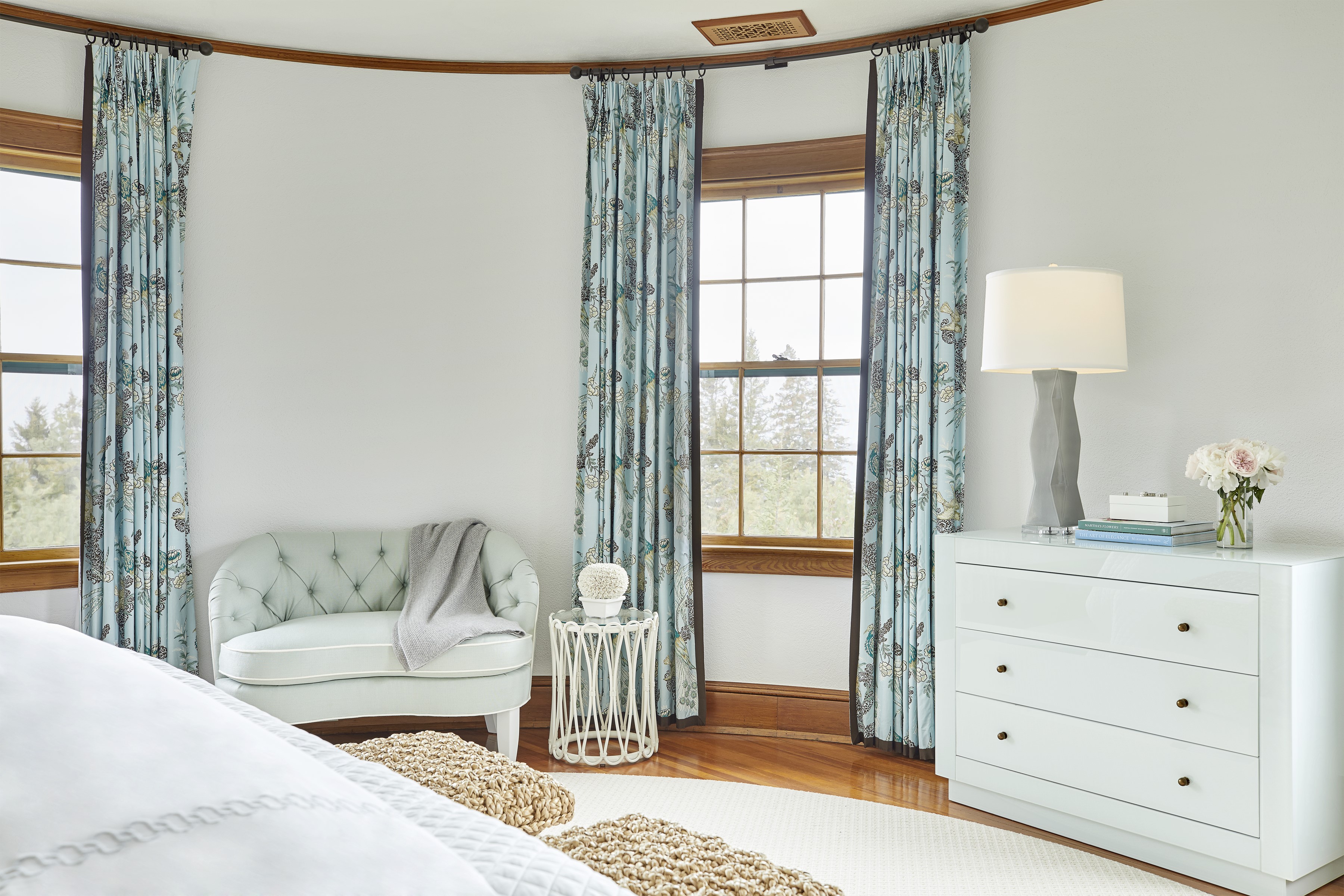
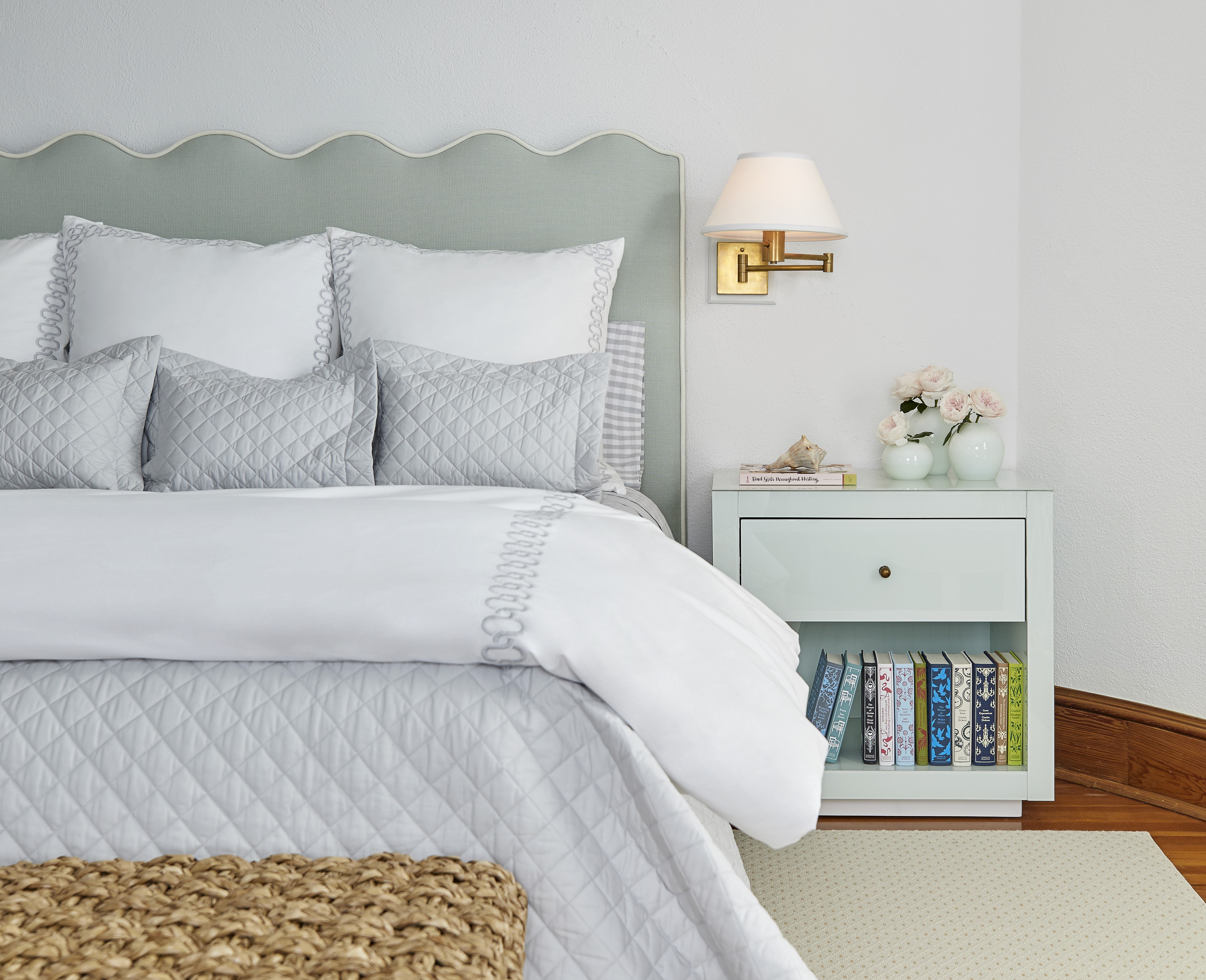
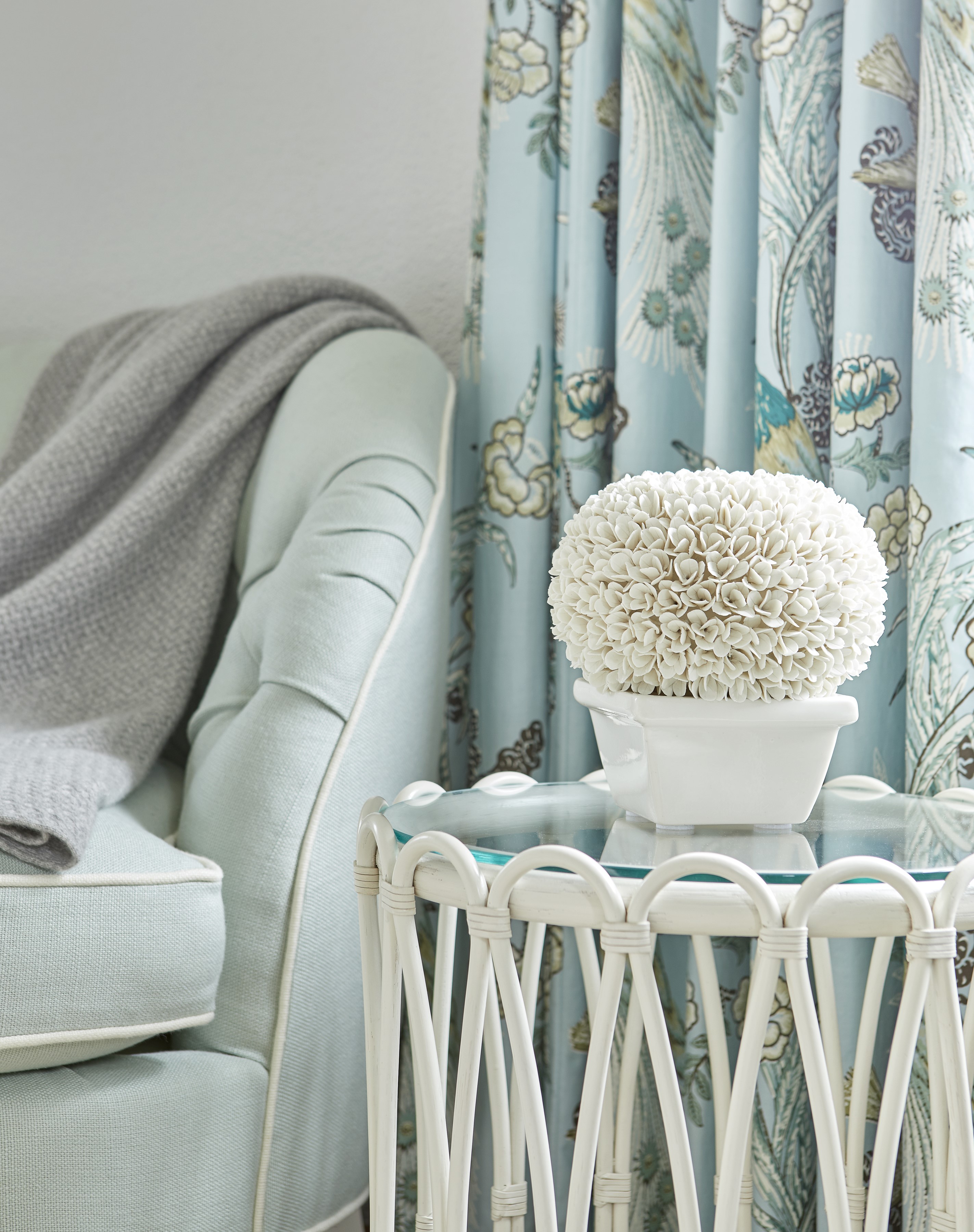
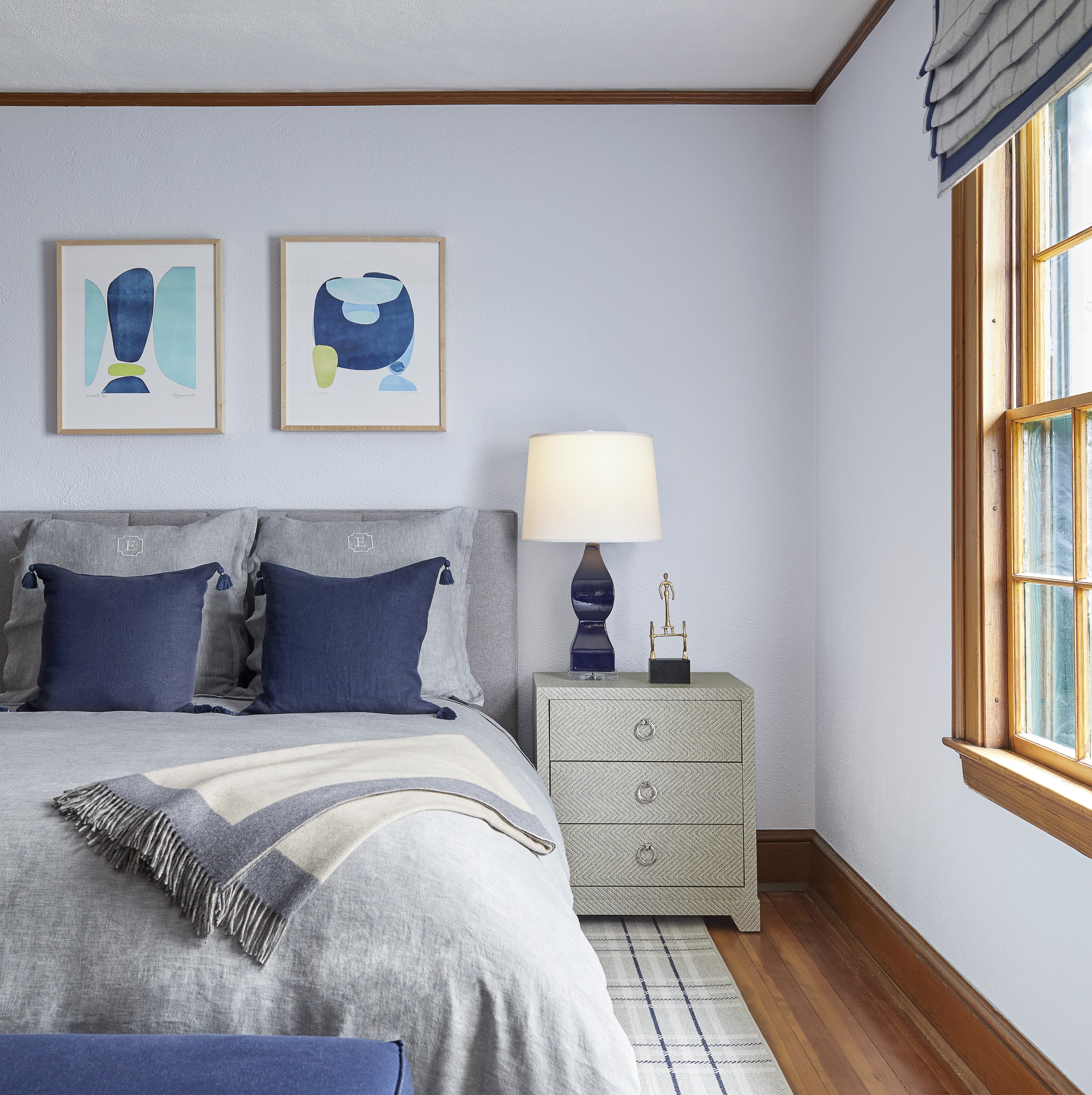
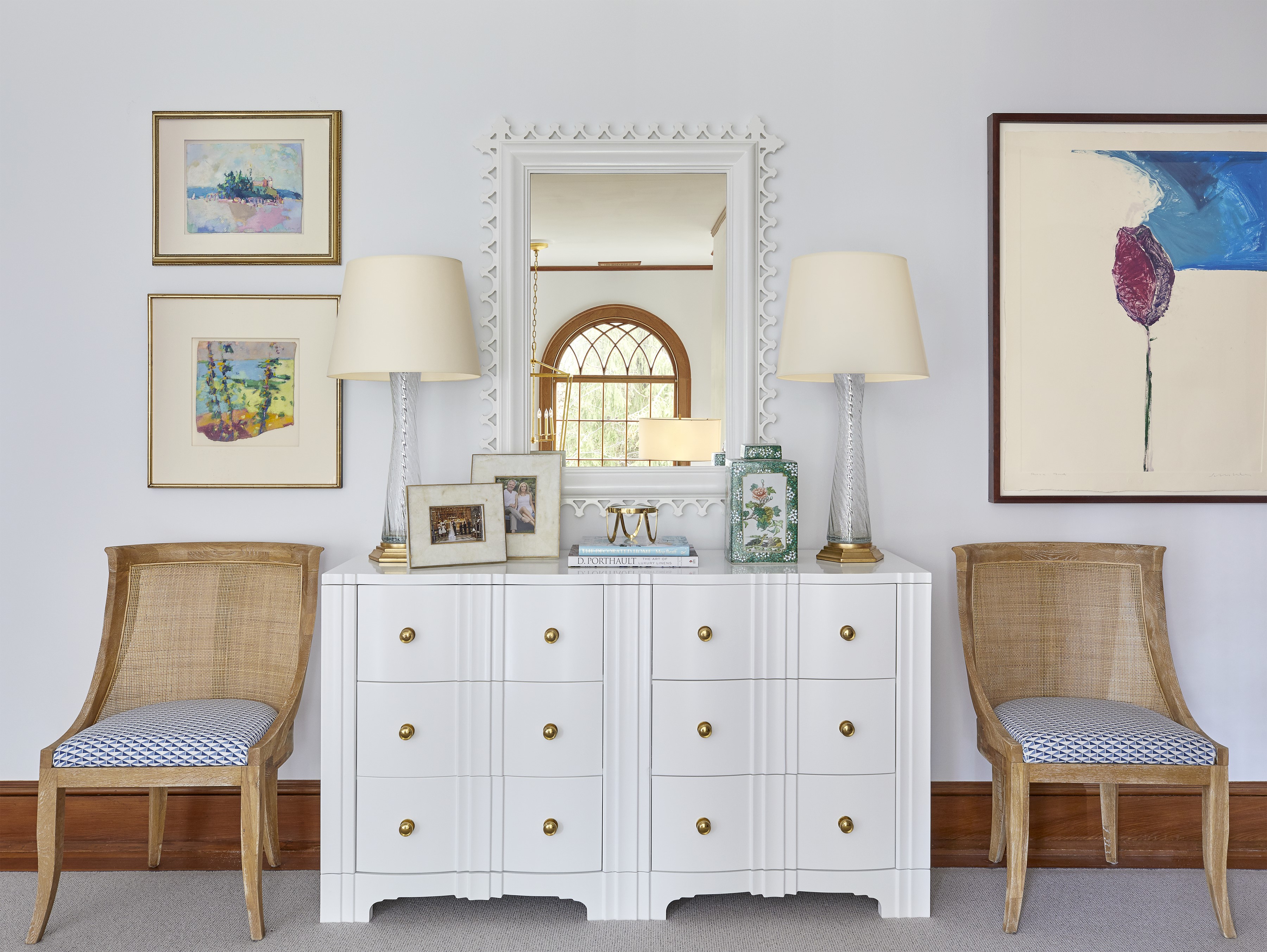
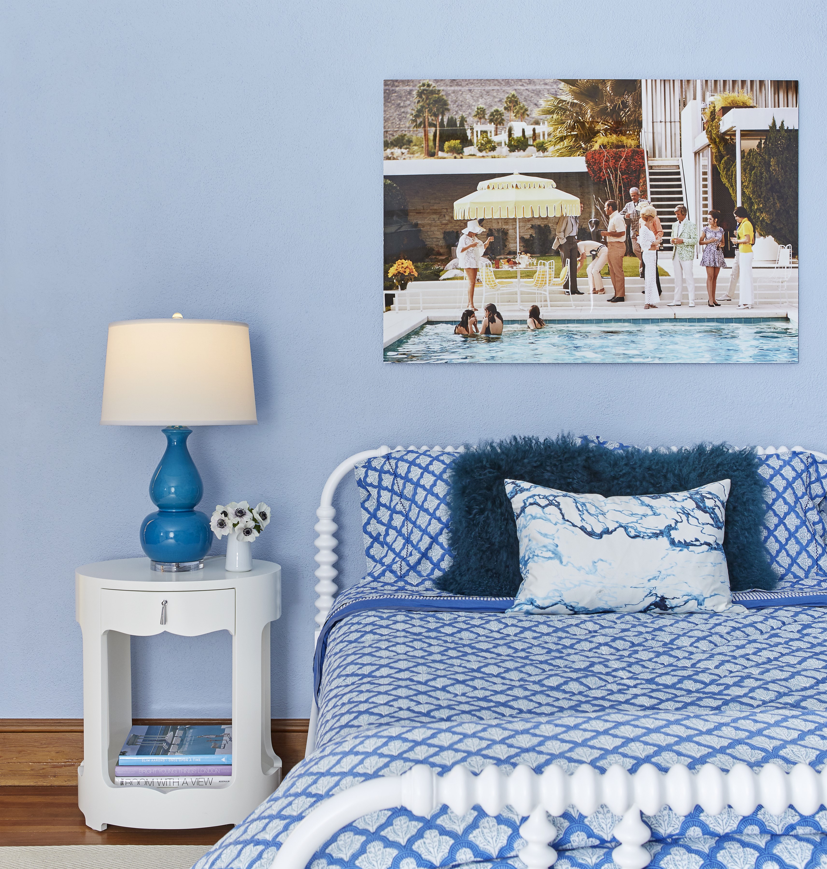
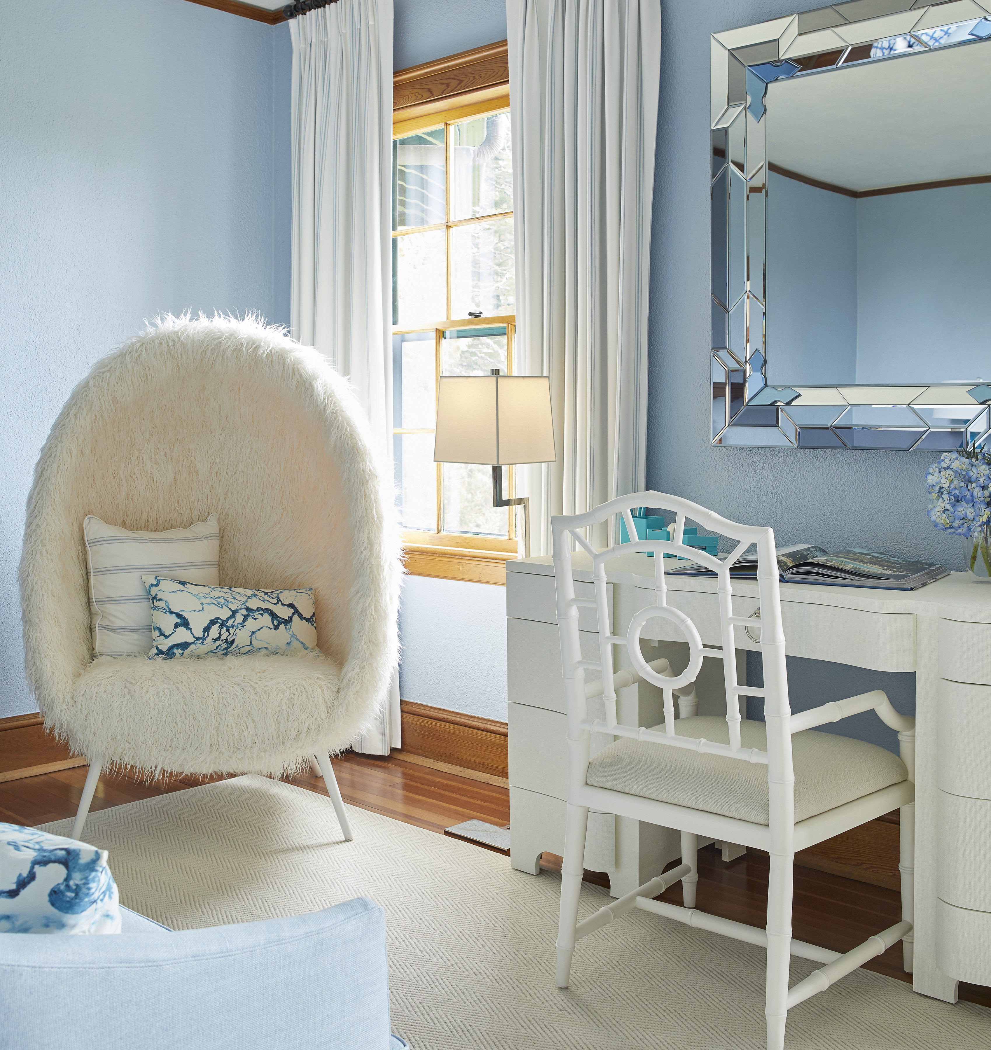
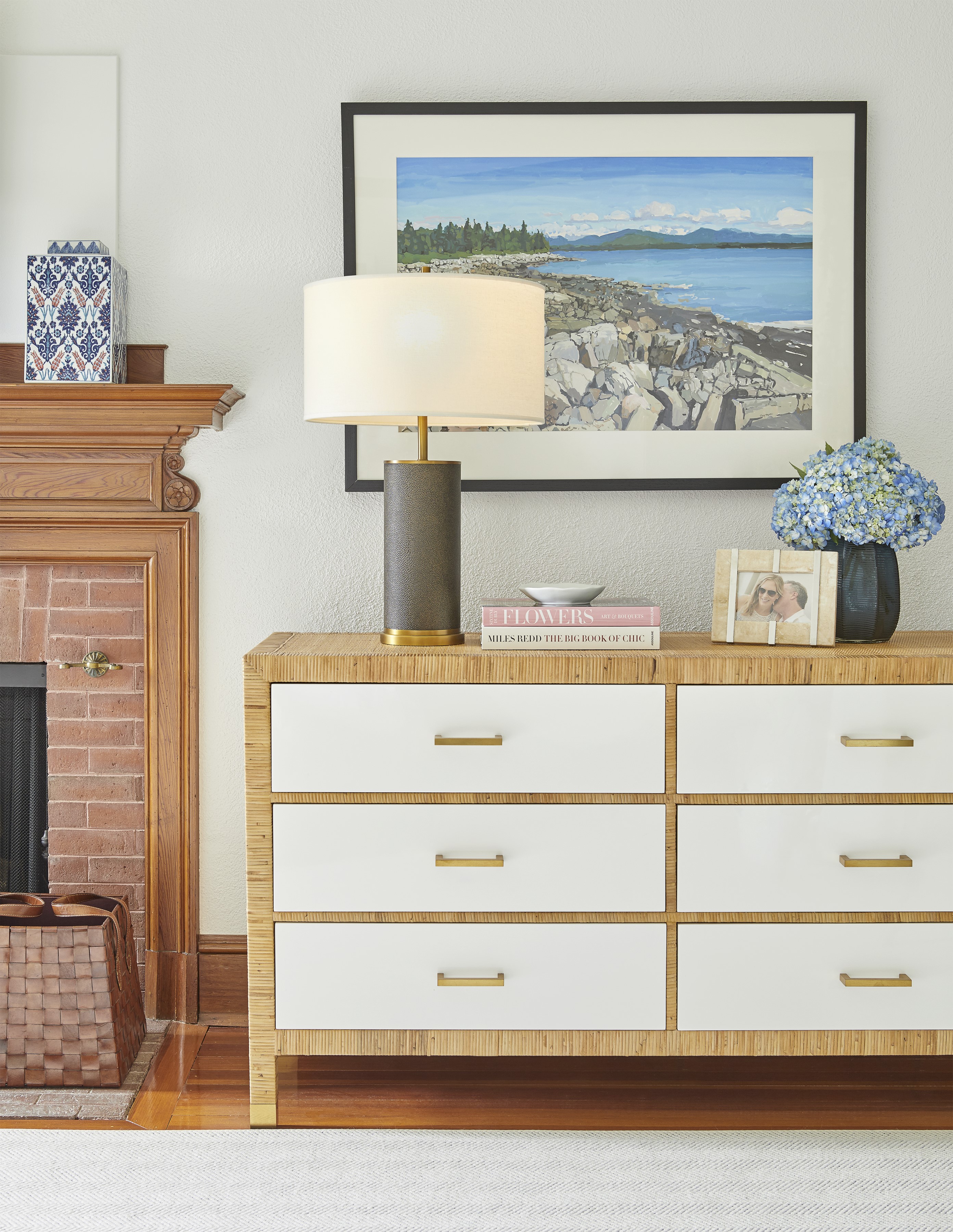
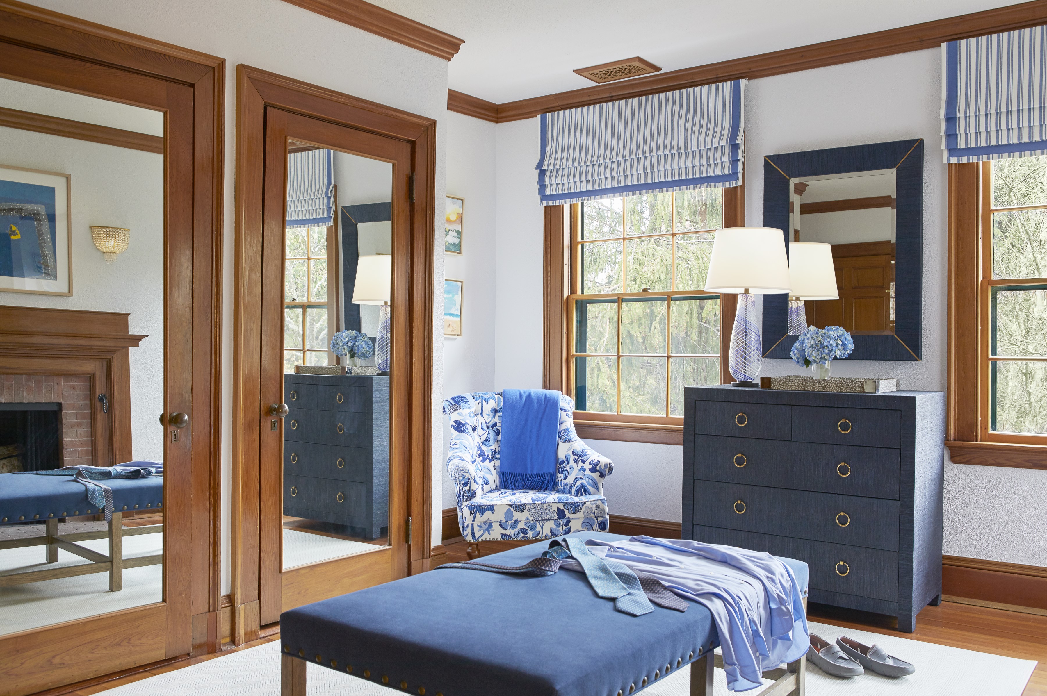
The new layouts comfortably accommodate two families. The second floor boasts two suites with his-and-hers closets and attached baths. One has a soothing, seafoam green palette, a gas fireplace, and an original spindle back settee. The other is wrapped in a fuchsia jute wallcovering. Here, Davis paired a mirrored desk with an existing faux bamboo chair that she adorned with a velvet cushion. “I love the juxtaposition of a humble antique against something extravagant,” she says.
“Tibet tiger” wallpaper by Clarence House lines Davis’s old childhood room, where she sometimes spent the night on the attached sleeping porch. Kids who stay here still use the hall bath, a storybook space with pink grapefruit wallpaper and its original cast-iron tub.
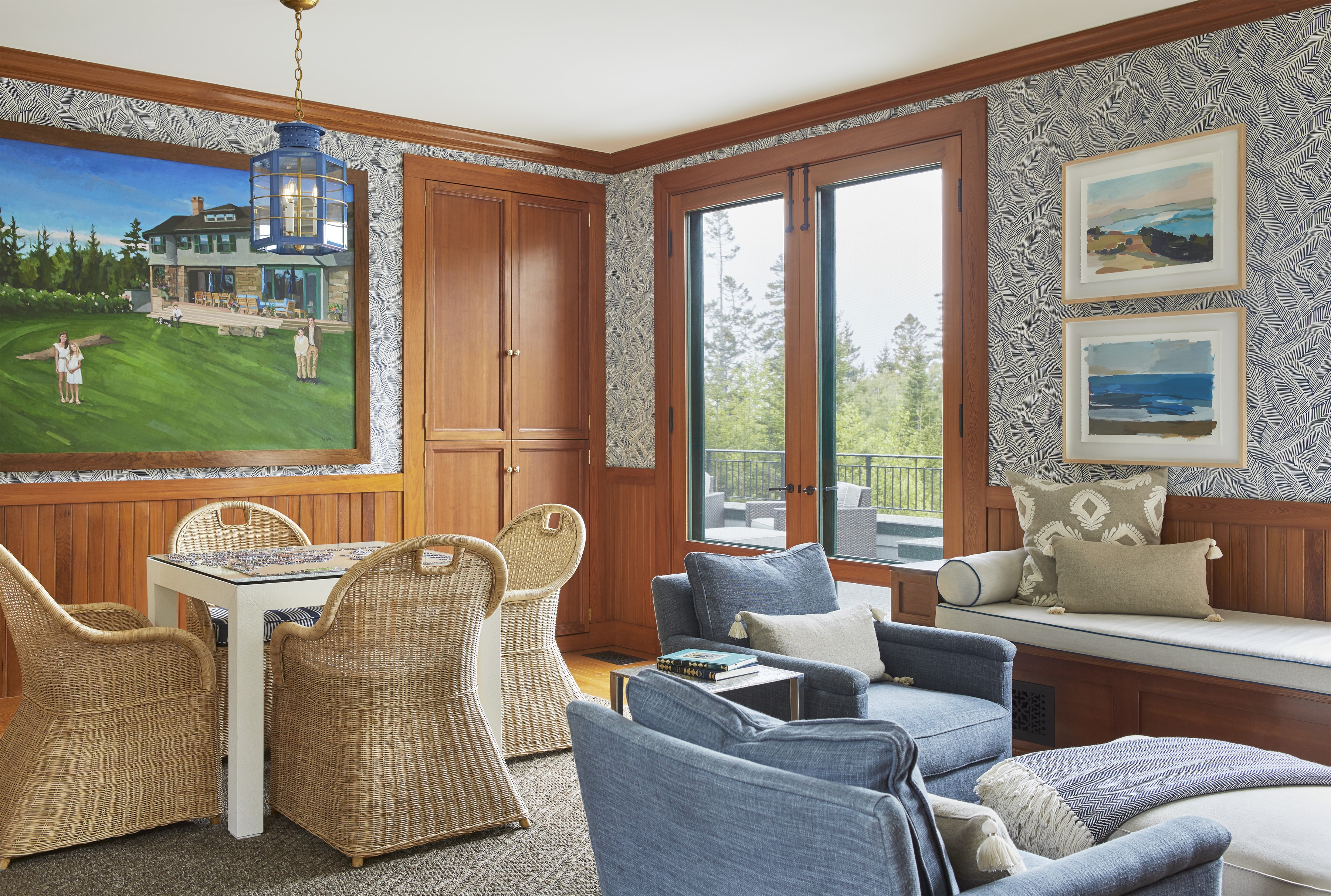
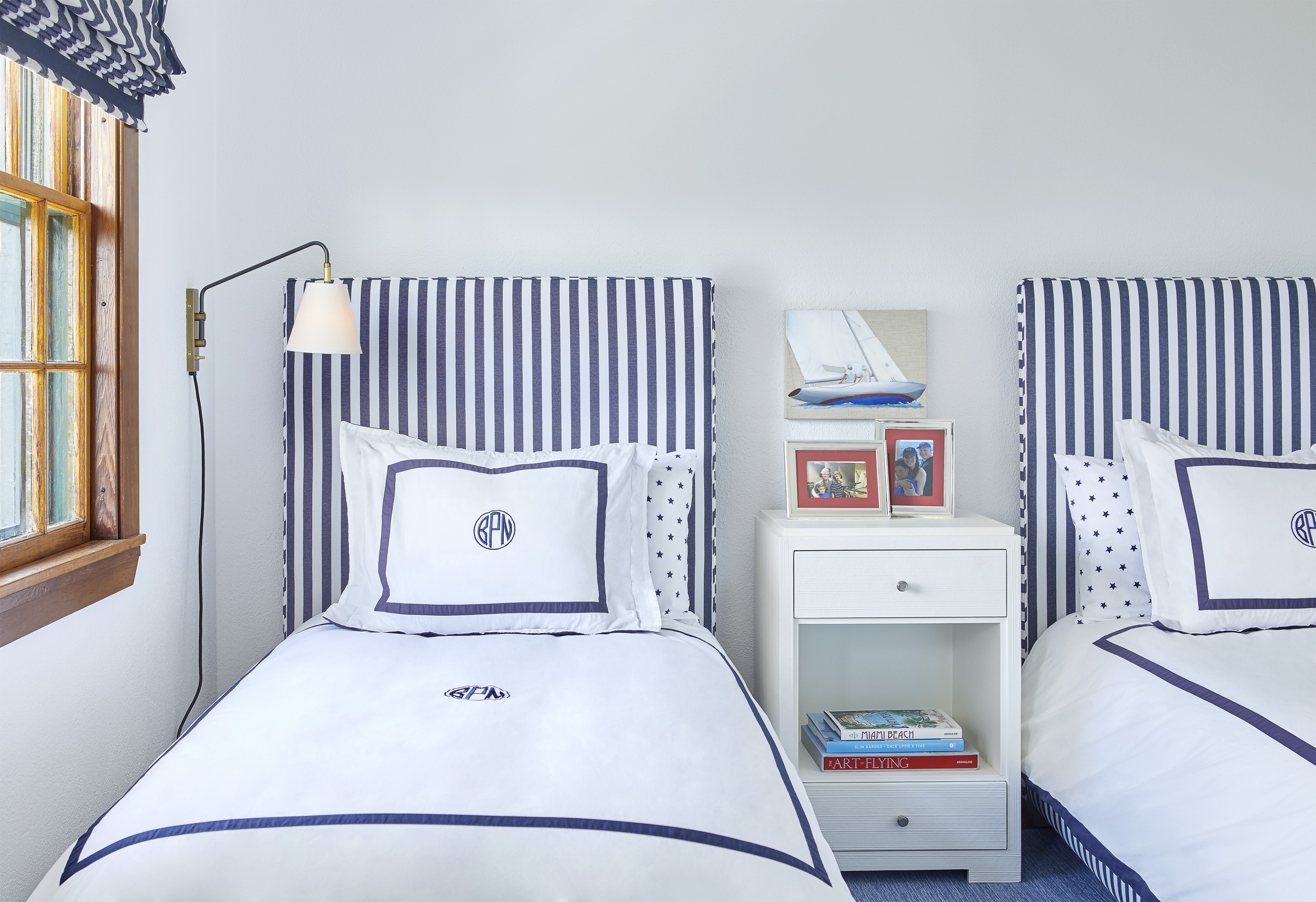
There are three additional bedrooms and two baths on the third floor. In the boldly patterned blue bedroom with bright red accents, Davis tucked a float-ing shelf into a niche beside an original iron daybed. Clarence House wallpaper with painterly, multihued trees cocoons the bedroom next door, where she nestled a pair of original iron beds under the eaves. Opposite the beds, a skirted table flanked by original Chippendale-style rattan armchairs accentuates the home’s “generation-after-generation summered here” vibe.
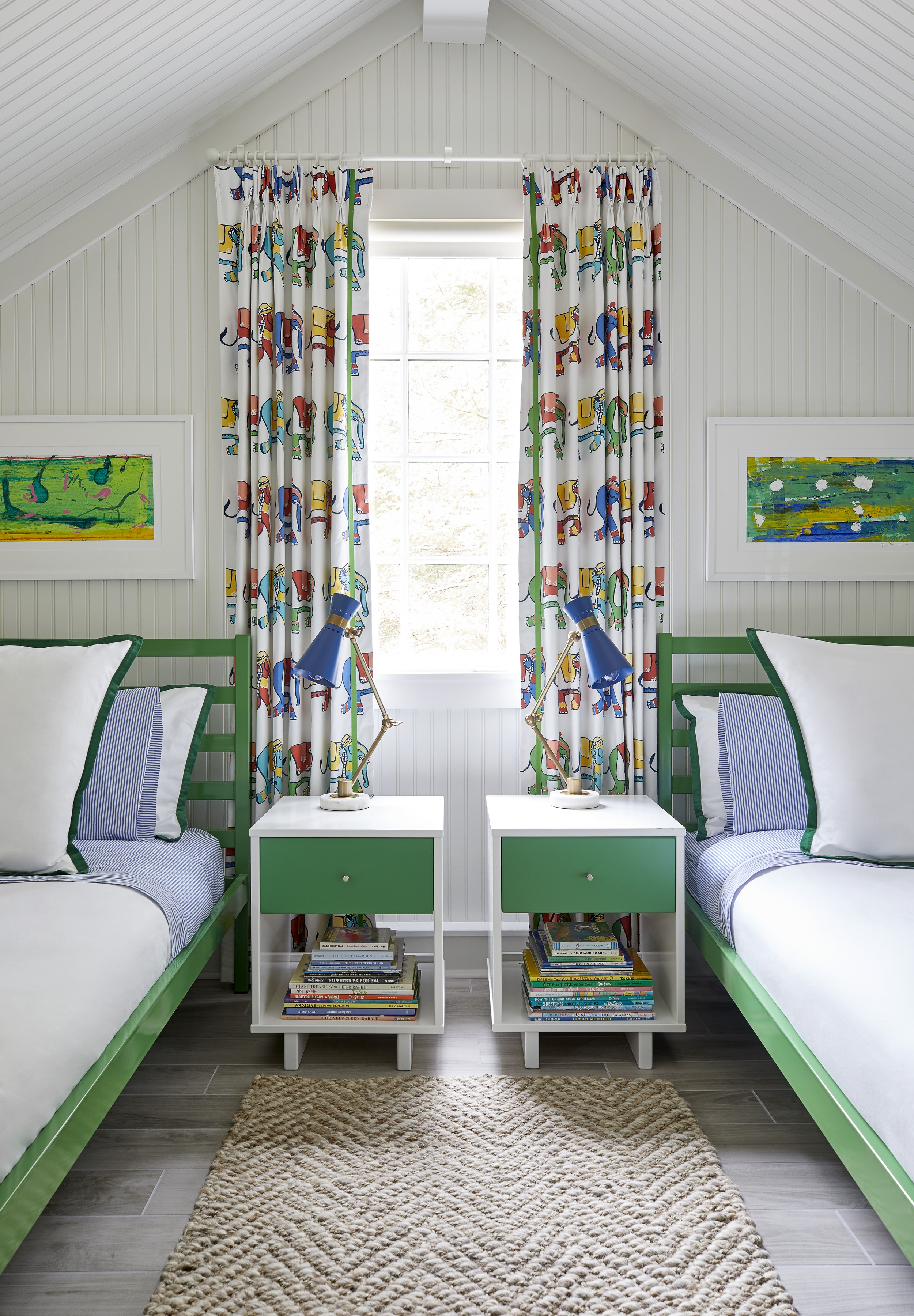
Unused attic space on that level became a cozy twin bedroom lined with wallpaper picturing silly dogs atop blue and white stripes. The headboards, upholstered in a Lilly Pulitzer print, hail from Davis’s stepson’s former bedroom in New York. One of her sons created the paintings over the beds. “Using children’s artwork is effortless,” the designer says. “If you frame it with a mat, it looks like a Matisse print.”
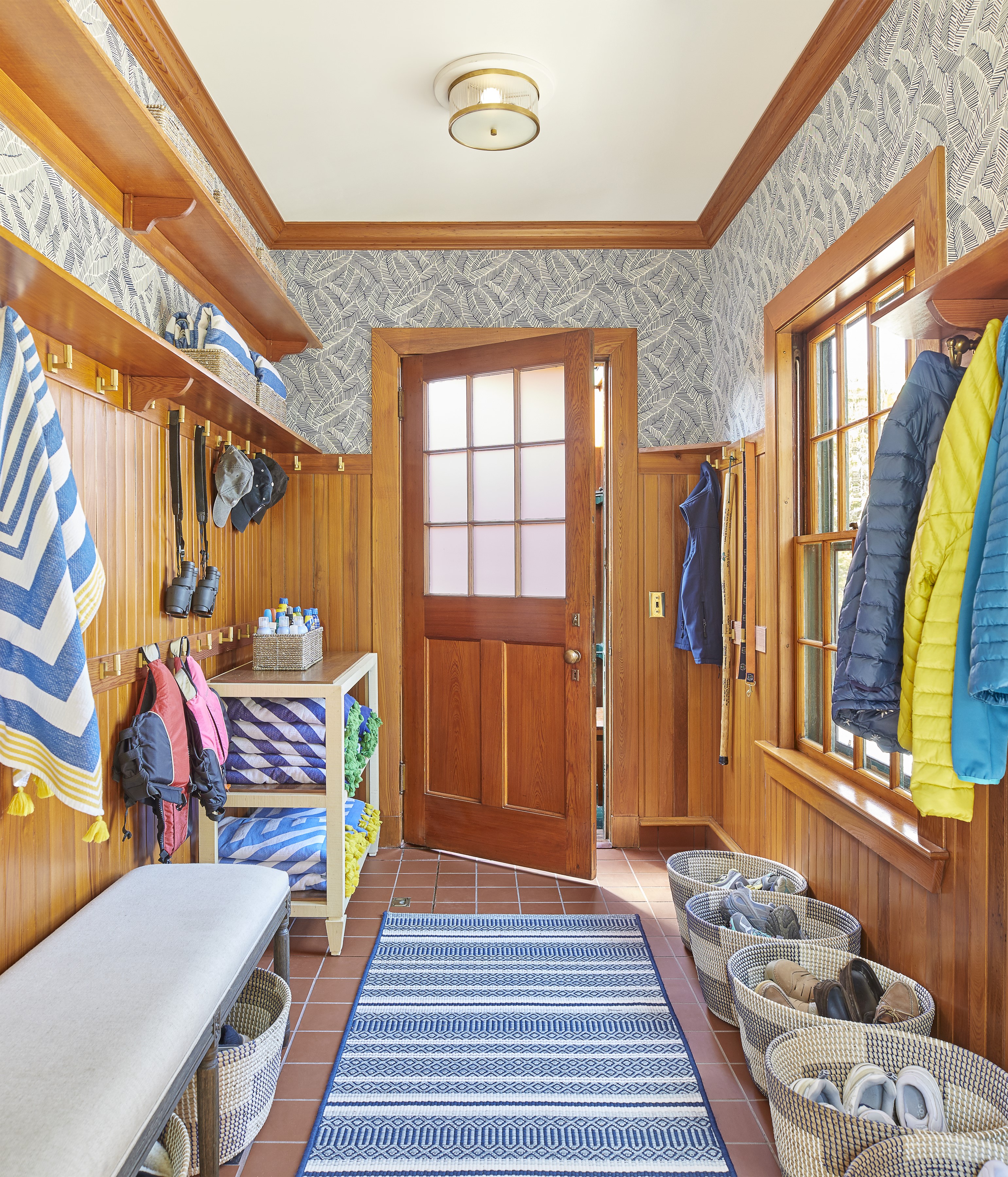
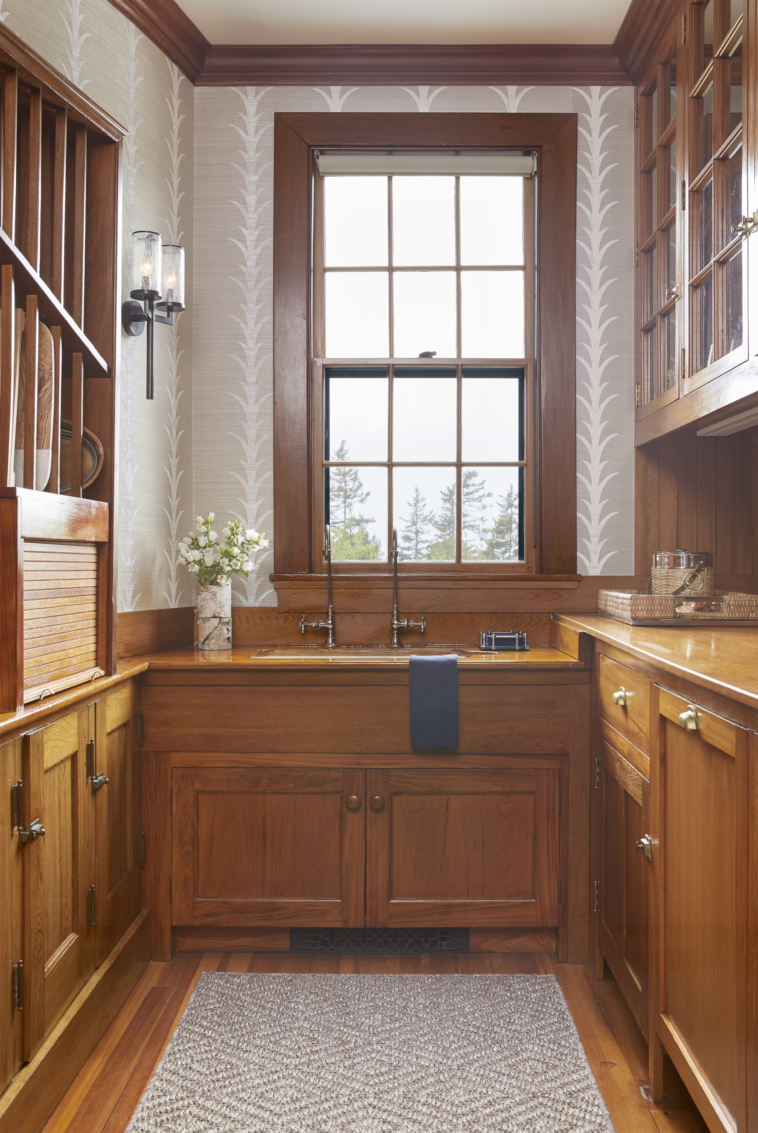
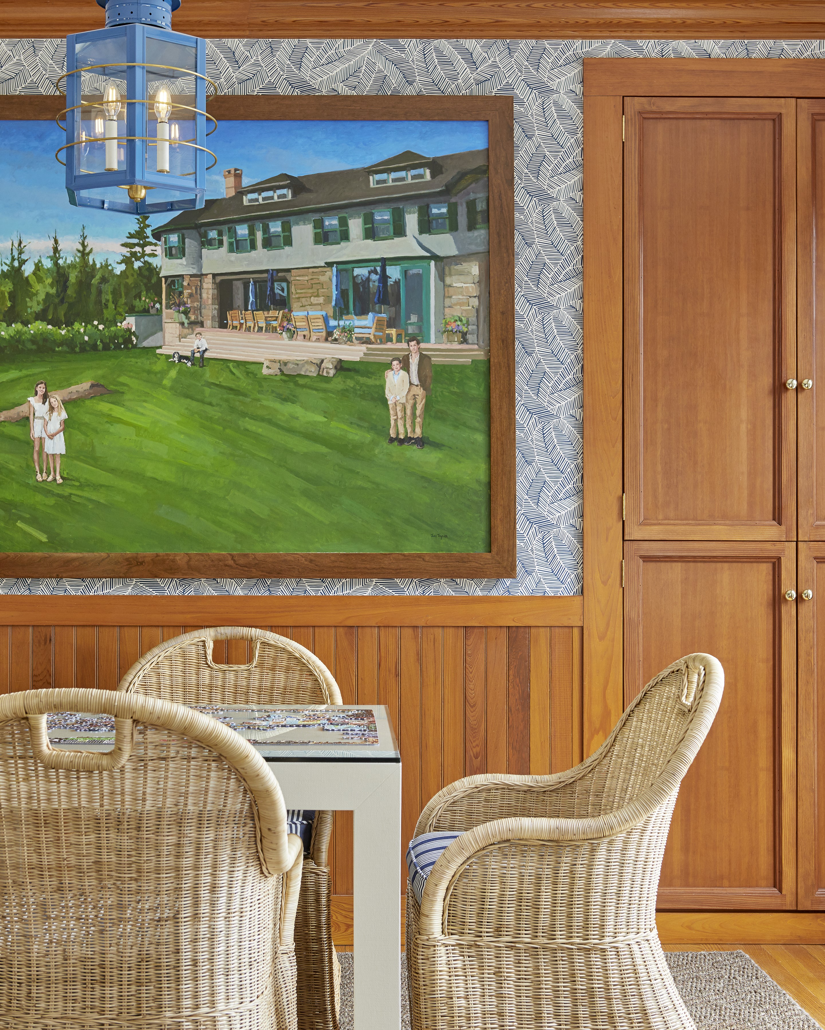
Davis reinvigorated the cottage, making it fun while maintaining its essence. Although the Passage West of her youth had painted, not papered, walls and rag rugs instead of sisal mats, the timeless patterns and the natural materials mixed with time-worn furniture and unfussy fixtures maintain the aura of the almost 100-year-old Maine cottage. “It’s still the Passage West that we rented, just fresher,” Davis’s mother says. “And, when you walk in, you immediately know it’s Maine.”


